Sunday, March 30, 2008

Dark Matter distorts light


From NASA.gov, an image depicting how Dark Matter (in red) distorts light from distant galaxies as it travels across the universe.
Explanation: Is the distant universe really what it appears to be? Astronomers hope not. Intervening dark matter, which is normally invisible, might show its presence by distorting images originating in the distance universe, much the way an old window distorts images originating on the other side.

Friday, March 28, 2008

17 Ways to Visualize Twitter


Also from FlowingData.com, this post about the many ways to visualize the Twitter universe is really cool. Twitter has really been gaining some momentum lately, but I keep looking for better ways to follow the posts.

Wednesday, March 26, 2008

21 Ways to Visualize Your Email Inbox


FlowingData.com has an entry on the 21 Ways to Visualize and Explore Your Email Inbox, which has some really cool visualizations.

Found on SimpleComplexity.net, thanks guys. I hadn't come across FlowingData.com before.

Sunday, March 23, 2008

Map of Creativity


Check out the Map of Creativity from the Next Generation Foundation.
The Map of Creativity is a user-friendly, interactive database of innovative educational projects throughout the world.

Wednesday, March 19, 2008

Name that Color

From blog.doloreslabs.com, they showed 1,300 different colors to people on Mechanical Turk, and asked them to name the color.
The above picture contains about 1,300 colors and the names for them that Turkers gave. Each is printed in its color and positioned on a color wheel. Just looking around, there sure seem to be different regions for different names. But there are also rich sets of modifiers (”light”, “dark”, “sea”), multiword names (”army green”), and fun obscure ones (”cerulean”).
They also created a Color Label Explorer tool to only show those color names that match your search term, but still keep them in place on the color wheel graphic.

Iraq by the Numbers


From foreignpolicy.com, a really tall chart showing statistical information covering the last five years of the Iraq war. I'm not sure I like the idea of this big chart that covers so many different types of data. The information on the bottom half of the chart tends to get lost to the reader.

Tuesday, March 18, 2008

New York Talk Exchange


Currently on exhibition at MOMA, The Museum of Modern Art, from Feb 24th - May 12th is an exhibit called "Design and Elastic Mind". New York Talk Exchange is included as part of the exhibition.

New York Talk Exchange illustrates the global exchange of information in real time by visualizing volumes of long distance telephone and IP (Internet Protocol) data flowing between New York and cities around the world.
Thanks Oliver!

Saturday, March 15, 2008

The Ebb and Flow of Movies

From nytimes.com. This is a very cool way to visualize the spike in movie ticket revenue when movies are released in theaters, and then slow down quickly after the first week. The graphic covers 1986-2007, and when you look back you can only find a few movies that maintained high ticket sales for more than a couple weeks. Star Wars Episode 1 and Titanic both had high sales for almost 6 weeks. Highlight and click any "wave" to see the details for that movie.
Summer blockbusters and holiday hits make up the bulk of box office revenue each year, while contenders for the top Oscar awards tend to attract smaller audiences that build over time. Here's a look at how movies have fared at the box office, after adjusting for inflation.
Thanks for sending in the link Dániel!

Thursday, March 13, 2008

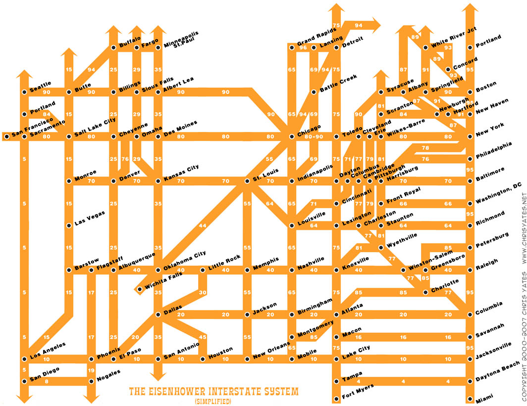
The Eisenhower Interstate System


What a fantastic way to simplify the U.S. interstate system into an easy to understand graphic. From Chris Yates on chrisyates.net. Style looks like a subway map.

Found on Digg.

Wednesday, March 12, 2008

Ocean's Thirteen infographics


I can't upload the video (for obvious copyright reasons), but the movie Ocean's Thirteen uses some cool infographics to show the real-time winnings at each table in the casino.