Showing posts with label travel. Show all posts

Tuesday, October 13, 2009

50 Years of Space Exploration - Visual Flight Map


National Geographic published this amazing flight map that shows the flight paths of all 200 space missions in the last 50 years.  A zoomable map is on the NG website, and a high-res image is available from Adam Crowe on Flickr.

Art by Sean McNaughton, National Geographic Staff, Samuel Velasco, 5W Infographics.

Found on Fast Company.

Wednesday, July 8, 2009

Why are Cheap Airlines so cheap? (infographic)


From 5WGraphics.com, a good side-by-side infographic comparison of why the cheap airlines can actually operate with lower fares to passengers. The cost comparison is in Euros, but those of us in America should be able to figure it out.

Wednesday, May 20, 2009

Cape Hatteras Lighthouse: The Move of the Millenium


Found on MagaMaps.com, I like the multiple elements included in this infographic.  Plus, I remember this lighthouse, and I can't believe they actually moved it!

Monday, April 13, 2009

A Century of Driving in America


From Good Magazine,  an infographic resembling a board game but in reality is a timeline.  Credits list Coleen Corcoran and Joe Prichard.

Thanks Alwyn for sending in the link!

Monday, March 2, 2009

Taking the Train

It's not a complicated one, but I like Good Magazine's summary of the biggest train systems in the world (top 5 U.S. cities and top 5 foreign cities).  The silhouettes represent the daily rides in the city, and the length of the train shows how many miles that system covers.  To the right is a quick map of each city's subway system and some statistics about their subway system.

Thanks Li, for sending in the link!

Friday, January 23, 2009

Why Do Freeways Come to a Stop?


This is a simple, good infographic that seeks to explain why traffic on freeways slows to a crawl without any apparent reason to drivers.  By Stephen J. Beard and Rich Exner in The Plain Dealer.

EDIT: Here's a link to the original article, and a high-res PDF of the infographic.

Tuesday, December 23, 2008

Immigration to the U.S. 1820-2007


Immigration to the US, 1820-2007 v2 from Ian Stevenson on Vimeo.

Cool video by Ian Stevenson (hosted on Vimeo) that animates the origins and number of people that immigrated to the U.S. every decade from 1820 to 2007.

Thanks Garrett for the link!

Monday, October 13, 2008

Air Traffic Worldwide movie

               
Air Traffic Worldwide 24HR from kouko a on Vimeo.

Very similar to the Flight Patterns video I posted back in October 2007, this is a video showing all commercial flight in the world over a 24-hour period.  The previous video was only the U.S., but this one shows the entire world.  It also shows the day/night areas and you can see the increase in air traffic as dawn rises around the world.  Its from the Zhaw School of Engineering in Zurich.

Found via FlowingData.com

Thursday, August 21, 2008

Olympic Maps of Beijing


Let's not forget the Maps!  NYTimes.com has a number of interactive maps of the Beijing area showing the event locations, new architecture built for the Olympics, the demolition and expansion of the old city over the last 10 years, the new subway routes and some of the routes for the marathon and cycling events.

Saturday, June 21, 2008

Fly Through Airport Security


"How to...Fly Through Airport Security" illustration by Jason Lee from Wired Magazine, March 2008 (16.03).
You might as well check your dignity curbside. Soon you'll be shoeless and flustered, spilling comics across the floor as you dig your MacBook from the depths of your duffel. But take a deep breath, frequent fliers: It is possible to pass security with your ego intact. Here's how.

Wednesday, June 18, 2008

Car HUD from the future


From the January 2008 (16.01)Wired Magazine; Artifacts from the Future, by Chris Baker. This future automobile HUD has some really cool features like a DUI driver identified ahead, in-car video chat, live GPS map with directions and a coupon for the Starbucks at the next exit. He's doing 90MPH, eating an energy bar and he's in the slow lane! For California, there definitely aren't enough cars on the road!

Looks a lot like a bunch of widgets on the desktop of your PC. It definitely seems too cluttered, but I think it was necessary to fit it on a narrow magazine page. I love that it seems to use a multiple-blink interface. Check out the calendar appointment in the top left: "...blink 3 times to reschedule."

If only this future were closer. I'm a real fan of car HUD interfaces. It's one of those promised technologies that still haven't become reality.

Sunday, May 18, 2008

Beer in Germany this week?


I'm headed to Nuremberg, Germany (also know as Nürnberg) for a trade show this week. Anyone in the area want to meet for a drink? Send an email to my Gmail account.

Thursday, May 15, 2008

Airport infographic video

Cool infographic video: airport by iain anderson (as shown in oz digital shorts in the sydney film festival 2005)

Found on funwithstuff.com

Sunday, March 30, 2008

Dark Matter distorts light


From NASA.gov, an image depicting how Dark Matter (in red) distorts light from distant galaxies as it travels across the universe.
Explanation: Is the distant universe really what it appears to be? Astronomers hope not. Intervening dark matter, which is normally invisible, might show its presence by distorting images originating in the distance universe, much the way an old window distorts images originating on the other side.

Thursday, March 13, 2008

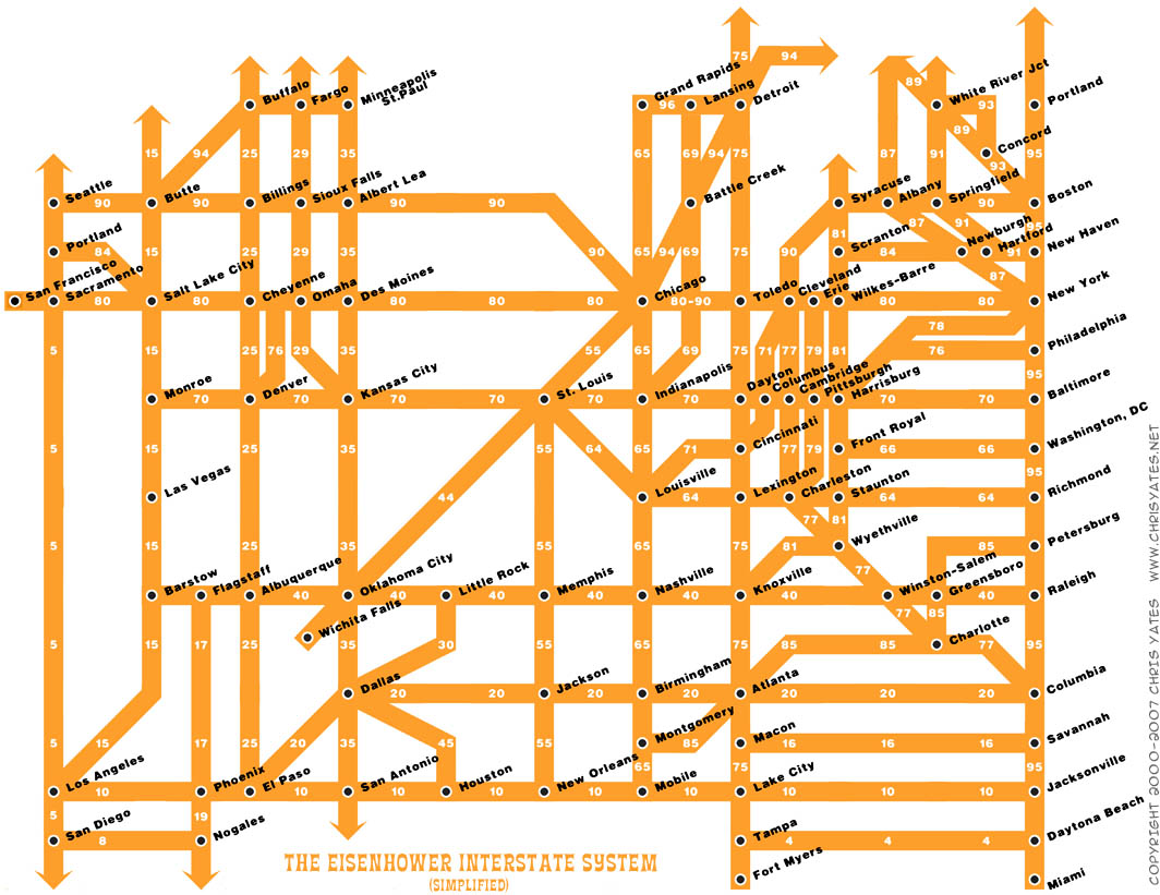
The Eisenhower Interstate System


What a fantastic way to simplify the U.S. interstate system into an easy to understand graphic. From Chris Yates on chrisyates.net. Style looks like a subway map.

Found on Digg.

Saturday, March 1, 2008

Lance's Last Tour


I found two good newspaper infographics from 2005 covering Lance Armstrong's last Tour de France on newsdesigner.com where you can get larger PDF files that make good posters. Both are two-page graphics (doubletrucks). The first is from The Oregonian (above), and the second is from the St. Pete Times (below).


Found on NiXLOG.

Sunday, February 24, 2008

Conquest of Mount Everest


Cool infographic poster from historyshots.com showing the many expeditions leading up to the 1953 successful team to make it to the top of My. Everest.
Every major expedition before the successful climb of Mount Everest is detailed on the left side of the print. The circles provide an easy to view key into the history of each expedition including expedition length, type and height achieved. The flow of climbers from one expedition to another is tracked with graceful lines.

The right side of the print is devoted to the successful 1953 assault. The entire expedition is mapped showing the exact climbing history by altitude of each of the main phases of the assault. In addition, the weather for each day is provided.

Monday, January 21, 2008

Harnessing the Wind


From the Telegraph in the UK, the idea is to use a kite to help pull a ship across the ocean. by using the wind power at high altitudes the ship would save on energy consumption.
Its inventor, Stephan Wrage, a 34-year-old German engineer, claims the kite will significantly reduce carbon emissions, cutting diesel consumption by up to 20 per cent and saving £800 a day in fuel costs.
Found on digg.com

Sunday, January 20, 2008

Race to the Moon


Cool poster I found over at historyshots.com shows the altitudes reached by all of the U.S. and Russian launches leading up to the 1969 moon landing.
From 1961 to 1969 the USSR and the United States were locked in a history-making race to land the first person on the moon. This detailed map explains the story of this titanic contest in a clear and informative manner.

Thursday, January 17, 2008

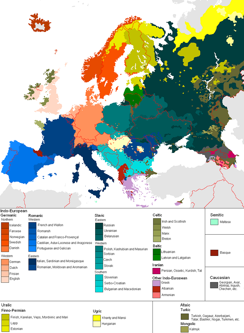
Map of European Languages


This is a great map, found on Photobucket.com uploaded by the user pizzler. In the U.S. we understand that other countries sometimes speak foreign languages, but we have the advantage that all 50 states speak the same language (or at least a similar version of the same language). So it's somewhat of an abstract concept to most Americans. And European geography isn't exactly a major topic in the U.S. school system, so most people don't understand how many countries there are, and especially how small some of them are.

This visual map really helps convey the diversity within the EU. It maps 46 languages across the European continent, and I know there are more. I can't imagine how difficult it must be for the EU to actually get anything done between countries.