
"The Graph" - The Future of Solar Power
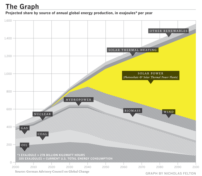
Known as "The Graph" in scientific circles, this chart projects the future of solar power. It was highlighted in a Fast Company article in December 2008.
The Graph was created by a scientific organization that counsels the German government, but it has since become a prized piece of propaganda, embedded in glossy brochures and PowerPoint presentations by solar companies from California to gray-skied Saxony. At the left-hand, present-tense end of the scale, solar power is a microscopic pencil line of gold against the thick, dark bands of oil and natural gas and coal, an accurate representation of the 0.04% of the world's electricity produced by solar power as of 2006. The band grows slowly thicker for 20 years or so, and then around 2040 a dramatic inversion occurs. The mountain-peak lines indicating the various fossil fuels all fall steeply away, leaving a widening maw of golden light as solar power expands to fill the space. By 2060, solar power is the largest single band, and by 2100 it is by far the majority share.


yeah, look at the energy situation 50 years ago and then try to predict with any accuracy where will be in 50 years from now.
ReplyDeleteThis graphs assuming that we invent nothing new. I have little doubt that 50-100 years from now the majority of our energy will come from volcanos, giant squids, saturn's rings, or the process of rubbing a balloon against a sweater.
Does anyone really believe this graph? Seriously?
ReplyDeleteLooks to me like someone took a swag at the electricity needs, and another at the supposed amount of oil reserves, and said, ooh, how do we make up the difference? It's only two or three orders of magnitude. Gee, I don't want it to be yucky nuclear. Maybe we can use solar power and put lots of solar panels out in the desert.
OilPoster.org
ReplyDeleteI would be cautious about any far sweeping predictions. We humans are incredibly bad at predicting the future. For example, the big spike on top of the Empire State Building was originally installed to serve as a diirigible (blimp) terminal. At the time, blimp service was seen to be the "next big thing" in transportation, a role the airplane eventually took.
ReplyDeleteSolar definitely has a place in our future, any such prediction makes a lot of broad assumptions about the future which remain to be proven.
Whether you believe it or not, it certainly does a good job getting its message across!
ReplyDeleteThe message it sends me is "this chart, therefore the maker of this chart, has no credibility."
ReplyDeleteDesigned by the always cool Nicholas Felton, of Feltron Annual Report fame!
ReplyDeleteNever mind the info, the design is really nice.
"Never mind the info, the design is really nice."
ReplyDeleteOh yeah, I almost forgot. Form over function.