Showing posts with label environment. Show all posts

Thursday, December 10, 2009

The Carbon Economy - Infographic Video


New infographic video from Xplane.com.  The Carbon Economy takes a look at the political landscape around climate issues and new, green markets are emerging.
Created with The Economist, the video conveys the state of global climate change and what steps must be taken to reach a positive outcome. The piece was shown at The Economist's recent Carbon Economy Summit in November 2009.
Timed with the publication of a special report in The Economist, The Carbon Economy summit examines how the political environment has changed since Kyoto and how committed regions and industries are to a sustainable carbon strategy.

Wednesday, September 2, 2009

Surface Area Required to Power the World with Solar Power


From LandArtGenerator.org, a world map visualizing the surface area required to power the world's electricity requirements using solar power alone in 2030, using current solar panel technology.  It's getting a lot of traffic on digg, reddit and Twitter too.

Also, check out the same idea, but for off shore wind power.

Tuesday, June 2, 2009

Déjà Poo: The Living Machine Sewage System


I saw that Nathan posted this one over on FlowingData this morning, and I had to share.  This is from a Wired article on howusing the plants in the lobby of an office building can help treat the sewage generated.

Monday, May 4, 2009

50 Cars or 1 Bus? Infographic Advertising!


Great visual ad by Flygbussarna in Sweden!  Combining a physical construction of a bus made out of cars on the side of the road, a live webcam, and live infographic information on the website!
Every day thousands of cars are driven to and from Swedish airports. Every car holds only 1,2 persons on average which is to be compared with the Airport Coach that takes over 50. Needless to say, this makes no sense whatsoever from an environmental standpoint. To highlight this, an enormous bus was built out of 50 cars on the side of the highway to the airport. On the website, a live camera not only shows the installation 24/7 but also analyses the image and tracks each and every car going by. This data is then being used to highlight just how much emission we could save just by going by bus instead.
 Thanks to @yplim on Twitter!

Wednesday, April 29, 2009

How Long Will It Last?


Good infographic from the New Scientist showing how many years we have left of our key natural resources.  Essentially these are basic bar and pie charts, but dressed up to make the overall graphic more compelling.  The message is still clear though, and the author gets his point across very strongly.

This comes from a 2007 article in the New Scientist called "Earth's Natural Wealth: an Audit" that include two more infographics as well.  The first is a map of where in the world are these natural resources are.


The next is a bubble graphic showing the scale of how much of each resource an average American will consume during their lifetime.


The Source listed on the first infographic: Armin Reller, University of Augsburg, Tom Graedel, Yale University

Found on FlowingData.com and numerous Twitter references.  Thanks Nathan.

Monday, April 20, 2009

Honda Ad: Keep Doing


Not sure if this Honda Ad is truly "infographics", but it's close.  It sounds like Garrison Keillor from "A Prairie Home Companion" doing the narration.

Thanks Paulo.

Wednesday, April 15, 2009

GE: Plug into the Smart Grid


Great interactive infographic website from GE for their Plug Into The Smart Grid ad campaign.  Beautiful graphics, fast, clean interface and all-around good job.  The viewer can change the setting, and see the infographic results change in response.


My son loves the Augmented Reality part!  Not really infographic, but fun.

Friday, March 13, 2009

Humans!


Watch more cool animation and creative cartoons at aniBoom

Here's a fun one for Friday.  Humans!  by Reza Rasoli.  Reminds me of The Matrix when Mr. Smith calls the humans a virus on the world.
Humans! is a 60 second global awareness PSA sensationalizing the excessive, all-consuming nature of the human being. This cute and naive Earth stands no chance against such an insatiable parasite. Witness its utter demise in a fun and sickening kind of way.
Thanks Hannu for the link!

Friday, March 6, 2009

Ford's New Green HUD Designs


Ford is working with design firms to develop concepts for a new HUD for its hybrid and future all-electric cars.  Here's the article from BusinessWeek.

Found on Twitter from Mitul69

Monday, February 9, 2009

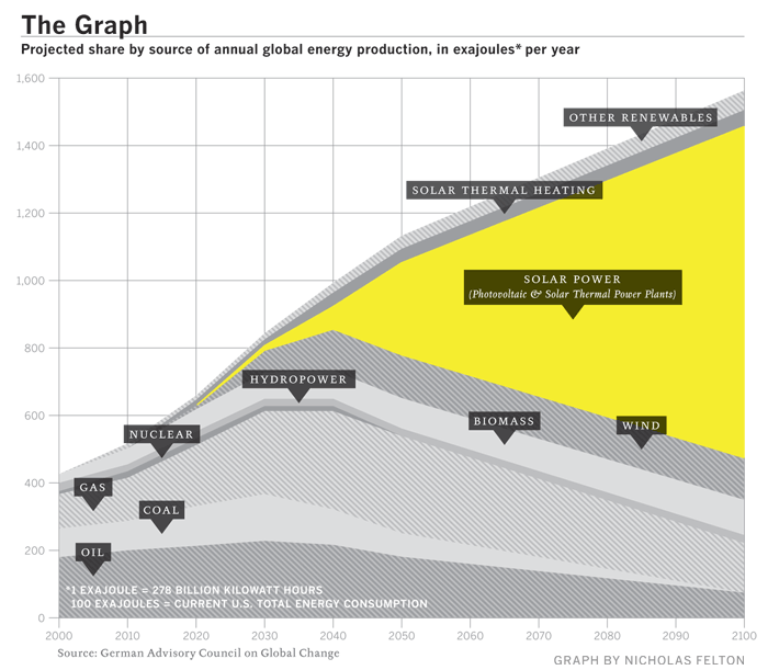
"The Graph" - The Future of Solar Power


Known as "The Graph" in scientific circles, this chart projects the future of solar power.  It was highlighted in a Fast Company article in December 2008.
The Graph was created by a scientific organization that counsels the German government, but it has since become a prized piece of propaganda, embedded in glossy brochures and PowerPoint presentations by solar companies from California to gray-skied Saxony. At the left-hand, present-tense end of the scale, solar power is a microscopic pencil line of gold against the thick, dark bands of oil and natural gas and coal, an accurate representation of the 0.04% of the world's electricity produced by solar power as of 2006. The band grows slowly thicker for 20 years or so, and then around 2040 a dramatic inversion occurs. The mountain-peak lines indicating the various fossil fuels all fall steeply away, leaving a widening maw of golden light as solar power expands to fill the space. By 2060, solar power is the largest single band, and by 2100 it is by far the majority share.

Friday, December 5, 2008

The Species-Scape


Christopher Taylor posted this image on his Catalogue of Organisms blog, and it has raised a little controversey about the details.  The intent is that the relative size of each organism in the image is representative of the number of species in that group.  So the large fly represents the huge number of insect species.  Towards that intent, I believe the image succeeds, but I have read some disagreement about the specific numbers used to develop the image.

In case you're wondering where the mammals are, we're represented by the reindeer cowering underneath the mushroom.
Two very similar images with some differences are also available.  One from the University of Sydney:


And another on from Cornell University: (this link wasn't working for me)


No matter which is exactly correct (and there's no way to tell), you get the point how small number of species of mammals are compared to the others.


Thanks Kevin, for sending in the link!

Thursday, November 13, 2008

Seasonal Visual Timelines


Roberto Rovira, and assistant professor of landscape architecture at the Florida International University's, School of Architecture, was kind enough to allow me to share some of his work with the readers of Cool Infographics.
 
Working as a consultant, these seasonal timelines were developed to show the activities and the plants used in a proposal for a project he led called "Envisioning Hudson Square" on the Hudson River near Manhattan, NY.
 
The first one shows the time of year that different activities would be active in this green area during the year like bicycling, bird watching and ice skating.  It also shows the different wildlife that would be present during the year like blue heron, striped bass and snowy egrets. Using the visual timeline you can see how the different activities overlap and that there would always be some type of activity during the year.
 
The second timeline from the same project show the proposed plant and trees to be used in the project, and with the use of the visual timeline shows their color and appearance throughout the year.
 
Graphics by Roberto Rovira, RLA, with assistance from landscape designer Kelly Woodward. Roberto is Assistant Professor in Landscape Architecture at Florida International University (www.fiu.edu/~soa) and Senior Landscape Architect consultant for ArquitectonicaGEO (www.arquitectonicageo.com), a Miami-based landscape and planning firm. He led GEO's design team and developed the concepts for 'Hudson Square Prints Green!', a proposal for a 30-block New York City district on Manhattan's West Side, adjacent to the Hudson River.

Wednesday, October 29, 2008

Classic infographic from 1823!


Here's a classic from 1823!  It a hand drawn infographic titled "Comparative Heights of the Principal Mountains and Lengths of the Principal Rivers of The World" by WR Gardner.  The high resolution image is on Flickr, but the post about the image is on bibliodyssey.blogspot.com.

This one makes a great poster!  Thanks Roi for sharing in the comments.

Tuesday, October 7, 2008

Vampire Energy infographic video & chart


From GOOD magazine, they created an infographic video about Vampire Energy, all of the energy used by electronics in your house while you are not actively using them.  The chart itself from the magazine is fairly simple chart, but I really like it.  It's effective getting the message across with simple graphics.

Friday, September 26, 2008

The Rush to Wind Farms!


The rush to wind farming is an interesting article in The Atlantic.  With Federal subsidies, its almost like a land rush.  The planned expansion of wind farm sites is impressive.

Thanks for sending in the link Garrett (also posted on Capturing Ephemera)!

Friday, August 22, 2008

Beijing Air Quality Index


NYTimes.com is also tracking the Air Quality Index by day during the Olympics using a heatmap style graphic.  There's definitely more pollution and particles in the air than most of the participants are used to.  So far, there have been a couple of days in the 90's, but didn't cross over 100 into the "unhealthy" range.

Wednesday, July 30, 2008

Bio-Suit EVA Infographic Poster


From the Man Vehicle Lab at MIT, an infographic poster from professor Dava Newman and illustrator Cam Brensinger.  The poster shows the technology development in spacesuits and some future design concepts.

Friday, June 27, 2008

Big Blue Marble: Water and Air


Found on infosthetics.com, phiffer.com and boingboing.net


Global water and air volume. Conceptual computer artwork of the total volume of water on Earth (left) and of air in the Earth's atmosphere (right) shown as spheres (blue and pink). The spheres show how finite water and air supplies are. The water sphere measures 1390 kilometers across and has a volume of 1.4 billion cubic kilometers. This includes all the water in the oceans, seas, ice caps, lakes and rivers as well as ground water, and that in the atmosphere. The air sphere measures 1999 kilometers across and weighs 5140 trillion tonnes. As the atmosphere extends from Earth it becomes less dense. Half of the air lies within the first 5 kilometers of the atmosphere.

Credit: Adam Nieman / Photo Researchers, Inc

I'd love to see one more showing all of the oil in the world.


The original appears to be here at PhotoResearchers.com

Wednesday, June 4, 2008

Greenwashing


From Futerra Communications:
Our Greenwash Guide (PDF) was born out of a desire to help communications professionals get their green messaging right. The majority of Greenwash is the result of over-eager communications campaigns that lack environmental rigour rather than malicious intent.
Found on Melodies In Marketing, thanks Mario!

Tuesday, June 3, 2008

The Infographic that Saved a Million Lives


Great story from 37signals.com about a very simple infographic that motivated Bill and Melinda Gates to change the focus of their charity spending.
“No graphic in human history has saved so many lives in Africa and Asia,” says NY Times columnist Nicholas Kristof about an infographic in a ‘97 Times article that spurred Bill and Melinda Gates to take action on public health.

...But then bill confessed that actually it wasn’t the article itself that had grabbed him so much—it was the graphic. It was just a two column, inside graphic, very simple, listing third world health problems and how many people they kill. but he remembered it after all those years and said that it was the single thing that got him redirected toward public health.