Stranger Than Fiction
This video is the introduction to the movie Stranger Than Fiction, full of infographics. It's been around for a while, but I thought I would share it too.

Lotteries in 42 states and the District of Columbia rake in billions of dollars, but much of the cash from ticket sales gets channeled back into prizes and lottery administration. States earmark the profits for programs like education, but the lottery dollars contribute only a small percentage of the total education funding.

Posted by
Randy Krum
at
8:17 PM
0
thoughts
![]()

Posted by
Randy Krum
at
10:05 PM
0
thoughts
![]()

 Found on Information Aesthetics, this is a map of all 4,294,967,296 IP addresses in the world. Blocks of addresses are shown grouped together in squares based on the owner (ISP, corporation, goverment, university, etc.), and individual addresses are shown as grey dots. The IP addresses that are listed on the Spamhaus XBL blacklist are shown as red dots, representing suspect addresses.
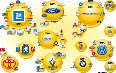
 I found three different images showing the complex network of ownership between the automotive companies. Three different attempts at making these complex relationships easier to understand. This first one is a scan from a magazine, but I can't find any reference to which actual magazine it came from. Charted out like a subway map, it's pretty easy to follow.


Posted by
Randy Krum
at
7:11 AM
0
thoughts
![]()
Labels: art, design, environment, grocery, photo, pollution, relative, scale

Posted by
Randy Krum
at
7:03 AM
0
thoughts
![]()
Labels: charts, election, history, internet, news, politics, presidential, relative

Posted by
Randy Krum
at
8:18 PM
0
thoughts
![]()
Labels: earth, environment, planets, sun, world


Posted by
Randy Krum
at
4:45 PM
0
thoughts
![]()
Labels: body, charts, health, map, personal, population, world
 Found on Visual Complexity, this chart from 1924 is an interesting variation of an organization chart. With the authoritarian leader in the center, the subordinates are mapped outward from the center. Rings at different radii show peer level responsibility.
Posted by
Randy Krum
at
6:47 AM
1 thoughts
![]()
Labels: CEO, charts, compensation, design, executive, relative, salary
 Another one for the "real world" infographics. This t-shirt from ThinkGeek will detect WiFi 802.11b or 802.11g wireless networks and display their signal strength on the front of the shirt. A great Christmas present for the geek in your family, for only $30.
Posted by
Randy Krum
at
6:38 PM
1 thoughts
![]()
Labels: internet, map, population, relative, web


Welcome to Breathing Earth. This presentation displays the carbon dioxide emission levels of every country in the world, as well as their birth and death rates - all in real-time. Though considerable effort has been taken to ensure that the presentation uses the most accurate and up-to-date data available, please remember that this is just a simulation.Breathing Earth was created by David Bleja (aka Stillwater), whose home website is stillwater-microcosm.net

Posted by
Randy Krum
at
9:41 PM
0
thoughts
![]()
Labels: charts, internet, population, web

