Showing posts with label politics. Show all posts

Thursday, December 10, 2009

The Carbon Economy - Infographic Video


New infographic video from Xplane.com.  The Carbon Economy takes a look at the political landscape around climate issues and new, green markets are emerging.
Created with The Economist, the video conveys the state of global climate change and what steps must be taken to reach a positive outcome. The piece was shown at The Economist's recent Carbon Economy Summit in November 2009.
Timed with the publication of a special report in The Economist, The Carbon Economy summit examines how the political environment has changed since Kyoto and how committed regions and industries are to a sustainable carbon strategy.

Monday, December 7, 2009

A Visual History of the Supreme Court - New Infographic Poster!


Today, I want to share the launch of Timeplots.com.  A new infographic site focused on designing visual timelines by Nathaniel Pearlman and Frank Hamilton.  The Timeplots.com site launched today highlighting their first project; a poster called "A Visual History of the Supreme Court of the United States".
This large-scale (48″x32″) print displays the full sweep of American federal judicial history from 1789 to 2009. It combines biographical information on every Supreme Court justice with a visualization of the influence of U.S. presidents and their political parties on the Court over time, and includes vote counts and summaries of landmark cases.
Months of work went into researching the history of the Supreme Court, and that effort really shows through in the level of detail in this poster.


It's a good thing they offer this as a large format poster, because the detail draws you closer to discover the events and landmark decisions that are the colorful history of the SCOTUS (Supreme Court of the United States).


I love that even on their About page, they created small, infographic timelines as a visual of their individual experiences and career histories.  Here's Nathan's:


Timeplots has also started a new service, Timeplots on Demand:
Timeplots’ dedicated staff is ready to work directly with you to honor your own organization—your company, school, nonprofit, team, church, or family—with a custom Timeplot of your institution’s history. Let us help you collect data, create memorable images, and visualize the developments of your institution.
Congratulations to both Nathaniel and Frank!

Tuesday, December 1, 2009

Vote With Your Dollars! - Corporate Political Contributions infographic


Vote With Your Dollars, is a corporate political contributions map.  Using the public data from the Center for Responsive Politics (2004-2008), GoodGuide.com has plotted the balance of contributions from companies.  Mouse-over a specific company logo to see the detailed data (like Dell above).
View the political contributions of your favorite companies and see how you vote with your dollars.  The data is surprising!
You can choose specific companies or business sectors, and then change the sort order.  Here is the retail sector sorted by Most Democratic Leaning:


Thanks Anthony for sending in the link.  Sorry it took so long to get posted.

Monday, November 9, 2009

ANC Spending infographic


Diaan Minhardt created this simple infographic for his blog, Dreamfoundry, to show how money being spend on new cars for government officials could have been spent differently to build houses.
I’ve been keeping an eye on the rivers of money haemorrhaging out of the government coffers for idiotic reasons for some time now. What I saw inspired me to create this very simple infographic.
Thanks Diaan!

Thursday, October 22, 2009

Left vs. Right Ideology Concept Map


David McCandless and Stefanie Posavec from Information Is Beautiful have created this Left vs. Right concept map to help explain the differences in political opinions.
Of course, the political spectrum is not quite so polarised. Actually, it’s more of a diamond shape, apparently. But this is how it’s mostly presented via the media – left wing vs. right wing, liberal vs. conservative, Labour vs Tory. And perhaps in our minds too… 
This kind of visual approach to mapping concepts really excites me. I like the way it coaxes me to entertain two apparently contradictory value systems at the same time. Or, in other words, I like the way it f**ks with my head.


Using this blank template, David and Stefanie created two versions  One for the U.S. (top) and one for the World (below).
There are two versions with different colours: a US and a World version. This is because the US and Switzerland are the only countries in the world where red = right wing and blue = left wing. Grrr!


Found on VizWorld and Information Is Beautiful.

Monday, September 14, 2009

Obama's Worldwide Stamps of Approval infographic


From our friends at GOOD transparency, is a simple infographic showing President Obama's worldwide approval rating.  I like the use of stamps to help identify the countries around the world, and that the order is representative of highest approval to lowest approval ratings.  I think this graphic lacks the use of illustration to convey the data.  The actual approval ratings are only communicated with the numbers without any graphic representation.
During the campaign, President Obama argued that his election would help restore the image the rest of the world has of United States.  In the six months since his election, his approval ratings at home have slipped, though they remain high. Around the rest of the world, opinion is mixed. A recent study by WorldPublicOpinion.org asked people in 21 countries whether they had confidence that Obama would “do the right thing” when it came to world affairs. Our latest Transparency is a look at their responses.
One other criticism would be that the text implies that we should be looking at how worldwide opinion has changed since Obama's election, but the data is actually only a snapshot of opinions six months after the election.  No indication is this is higher or lower than the opinions at the time of his election.

A collaboration between GOOD and Michael Newhouse at Newhouse Design.

Thanks Michelle for the link!

Tuesday, August 18, 2009

American health care on (4) napkins


Dan Roam, author of Back of the Napkin, has posted a napkin explanation of the American Health Care debate on his blog.  It took him 4 napkins to complete his explanation, but I think he did a really good job trying to help people understand a very complex issue.

He has also published a slideshow of the complete series up on SlideShare.net


Check out Dan's great book, Back of the Napkin.


Tuesday, August 4, 2009

NEW Death and Taxes 2010 poster!!


First, Jess from WallStats.com has released the 2010 Death & Taxes poster.  This is one of the best infographic examples today.  It's extremely informative, and the topic has a very wide reach.  The Death & Taxes poster from 2007 was my initial post on Cool Infographics, so I'm very excited to see this update.   Now the 2010 version is available to purchase as a poster here. Great job Jess!

Second, I'm really impressed by the viewer code for the poster. It's from Zoomorama.com, and lets me embed the interactive viewer.  The built-in zoom is pretty nice, but the Quick Find index on the left side is the best part.


Friday, July 24, 2009

One Trillion Dollars Visualized [infographic video]


New video based on the infographics from our friend, Jess Bachman, from WallStats.com!  Created by/for Mint.com.

Trillion is the new Billion!

Friday, April 10, 2009

Free The Vote! (Spanish)


Infographic video from NSM in Santiago de Chile for the Free The Vote Campaign. I don't speak Spanish, so I'm not exactly sure what it says...

Thanks Marco, for broadening my horizons!

Thursday, March 12, 2009

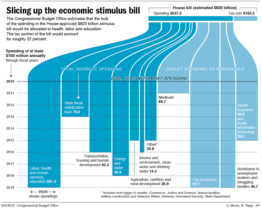
Visualizing the Stimulus Bill


Here's a great, simple graphic that breaks down the stimulus bill.

Nicholas Rapp does some great infographic design work.  Check out some of his other work at nicolasrapp.com

Wednesday, February 25, 2009

Taking Apart the $819B Stimulus Package


Very detailed infographic from the Washington Post showing how the proposed stimulus package is broken out between ares of spending and tax cuts.

The centerpiece of President Obama's domestic agenda is an $819 billion economic stimulus plan. The Senate will consider the measure this week, with an eye toward the amount of tax cuts and spending. Republicans and Democrats spar over what to consider a tax cut. An analysis by the nonpartisan Congressional Budget Office tallies the tax-cut portion to be significantly less than the one-third Democrats claim it to be.

SOURCE: Congressional Budget Office | Reporting by Karen Yourish, graphic by Laura Stanton - The Washington Post - February 01, 2009

Wednesday, January 21, 2009

A New President - Wordle

Wordle: A New President

I don't think I've ever posted about Wordle.net. So I thought this word cloud of President Barack Obama's inaugural address yesterday would be a good example.
Wordle is a toy for generating “word clouds” from text that you provide. The clouds give greater prominence to words that appear more frequently in the source text. You can tweak your clouds with different fonts, layouts, and color schemes.

Monday, December 8, 2008

The Hidden Cost of War


Found on both Information Aesthetics and Visualizing Econmics.

Tuesday, October 28, 2008

Map of Newspaper Presidential Endorsements


Staying on the presidential election theme, here's a great infographic on infochimps.org.  Red shows newspapers endorsing McCain, and Blue show newspapers endorsing Obama.  The inner color of each circle also represents which candidate the newspaper endorsed in the 2004 election.  The size of the circle represents each newspapers circulation.

Also notice the mismatch between the newspaper endorsement and each state's "Red vs. Blue" alignment.

Thanks Garrett for the link!

Sunday, October 26, 2008

Does Your Vote Matter? YES!


Sticking with the stuff from GOOD magazine, this is one of the GOOD Sheets available for sale as a poster at Starbucks for a limited time.  I've been looking for some good election related graphics.  There are a ton out there, but I'm looking for the gems.

I hear all the time that people don't think their vote matters, and in some cases it may get lost in an election that isn't close or competitive.  However, you never actually know if a race is going to be close or not (unless there is only one candidate).

In some of our local elections, I've seen some decisions put up to vote that won by only 12 votes!

I'm not pushing any specific politcal opinion, just that everyone should get out and vote.  Early voting is already open in many areas, so do your part and be heard!

Wednesday, October 22, 2008

It's the Economy, Stupid!


Great timeline from GOOD Magazine (via picdit.com).
What most of the doom-and-gloom reports on our economy don’t provide is perspective—a historical survey of an economy that’s been through more than a few ups and downs in its day. Here’s a farsighted view of how our temperamental economic machine works, and a close-up of how it stands today.
Thanks Adam!

Monday, October 20, 2008

NEW Death and Taxes 2009 poster


New Death and Taxes infographic for 2009!  Interactive viewer let's you zoom in to see all of the details.
"Death and Taxes:2009" is a representational poster of the federal discretionary budget; the amount of money that is spent at the discretion of your elected representatives in Congress. Basically, your federal income taxes. The data is from the President's budget request for 2009. It will be debated, amended, and approved by Congress by October 1st to begin the fiscal year.

The poster provides a uniquely revealing look at our national priorities, that fluctuate yearly, according to the wishes of the President, the power of Congress, and the will of the people. If you pay taxes, then you have paid for a small part of everything in the poster. 
The Death and Taxes poster from 2007 was my initial post on Cool Infographics, so I'm very excited to see this update.  Now the 2009 version is available to purchase as a poster here.

Friday, August 15, 2008

National Debt and the Presidents


First, I'm not pushing any particular political agenda.  There's considerable debate around this chart, so I don't want to start any arguments.  The debate isn't around the validity of the data, but about how it's being presented.  The information is freely available from the U.S. Department of the Treasury and the Bureau of the Public Debt.


Second, I like that this chart takes a simple bar chart and adds a few more layers of information.  At its root, this is a timeline of the increase in the national debt based on the federal budget by year.  Then layered on top of that are the presidents in office that year, some color coding, the political party controlling the White House and highlights for record years.


Third, just to share the reasons for the debate.  This is a great example of data being visualized with a specific agenda in mind.  Obviously, this is a chart framed to make Republicans look bad, and Democrats look good.  The debate centers around a few issues like programs started by one President will carry into the term of another President and more importantly that the political party controlling Congress actually has more impact on the federal budget than the President does.

Friday, July 4, 2008

U.S. Flag Infographic


For the 4th of July, I wanted to post a new link to the U.S. flag as an infographic, but it looks like the "Meet The World" brazilian website that I posted about in February 2008 is down right now.  I still have the image, and its from the flag series by artist Icaro Doria. 

Icaro Doria is Brazilian, 25 and has been working for the magazine Grande Reportagem, in Lisbon, Portugal, for the last 3 years. He is part of the team (with Luis Silva Dias, João Roque, Andrea Vallenti and João Roque) that produced the flags campaign which has been circulating the Earth in chain letters via e-mail.