Showing posts with label bubble. Show all posts

Wednesday, April 29, 2009

How Long Will It Last?


Good infographic from the New Scientist showing how many years we have left of our key natural resources.  Essentially these are basic bar and pie charts, but dressed up to make the overall graphic more compelling.  The message is still clear though, and the author gets his point across very strongly.

This comes from a 2007 article in the New Scientist called "Earth's Natural Wealth: an Audit" that include two more infographics as well.  The first is a map of where in the world are these natural resources are.


The next is a bubble graphic showing the scale of how much of each resource an average American will consume during their lifetime.


The Source listed on the first infographic: Armin Reller, University of Augsburg, Tom Graedel, Yale University

Found on FlowingData.com and numerous Twitter references.  Thanks Nathan.

Monday, August 18, 2008

Olympics Medal Count Map


The Medal Count Map from the NYTimes.com show the total number of medals each country has won in every olympics since 1896.  Choose a year on the timeline to animate the graphic.  Rolling your mouse over a country will show the breakdown of Gold, Silver and Bronze medals and clicking will bring up a complete list of the events and medal winners.

Thursday, July 3, 2008

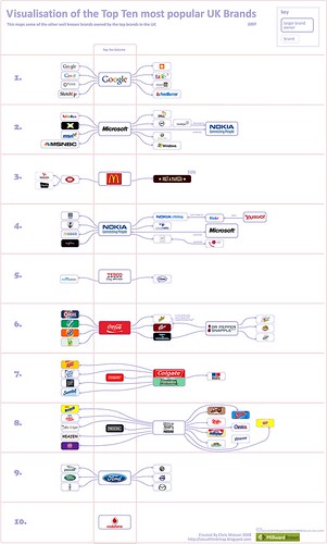
Top 10 UK Brands 2007 Visualisation


Top 10 UK Brands 2007 Visualisation, originally uploaded by visual think map.
Inspired by the infographic "Who Owns the Car Companies" that I originally posted about in October 2007, Chris Watson, from Visualthinkmap.blogspot.com, has created a cool infographic showing the owners for some of the top brands in the UK.

Great job Chris!

Monday, November 12, 2007

Grokker


It's not new, but Grokker does a good job of searching multiple sites and mapping the data back to the user in visual form.
...a web-based enterprise search management platform that leverages the power of federated content access and visualization to maximize the value of information assets for enterprises, content publishers, libraries and other research-intensive organizations.

Tuesday, October 23, 2007

Who Owns the Car Companies?

I found three different images showing the complex network of ownership between the automotive companies. Three different attempts at making these complex relationships easier to understand. This first one is a scan from a magazine, but I can't find any reference to which actual magazine it came from. Charted out like a subway map, it's pretty easy to follow.

This next one from Too Many Cars is charted like a family tree, or a mind map. It's the easiest the follow, but probably the least aesthetically pleasing. Online the image is broken into smaller pictures so you can zoom closer, but is also available as a large poster in PNG or PDF formats. The data for this one is from 2006, and is the most current of the three.


This last graphic claims to show the ownership mix in the auto industry as a form of bubble chart, but I can't find any date or source data link. I think the bubble sizes represent something, like size of the company or ownership, but I can't tell. So I can't tell how accurate this is. The image is on Tinypic.