Thursday, July 31, 2008

Anatomy of a Balloon Animal


Now here's an odd poster by Jason Freeny depicting the internal anatomy of balloon animals.  Check it out along with his other works at Moist Productions.  I especially liked that he included visual instructions on how to create the balloon animal at the bottom.


Thank Torquil for sending in the link!

Wednesday, July 30, 2008

Bio-Suit EVA Infographic Poster


From the Man Vehicle Lab at MIT, an infographic poster from professor Dava Newman and illustrator Cam Brensinger.  The poster shows the technology development in spacesuits and some future design concepts.

Tuesday, July 29, 2008

Radiohead: House of Cards visualization video


Really cool use of visualization tools to create this music video for Radiohead's "House of Cards".

Check out this link to a different version on Google that lets you move the video image around while its playing. and the "making of" video that shows the laser scanners they used.
Radiohead just released a new video for its song "House of Cards" from the album "In Rainbows".

No cameras or lights were used. Instead two technologies were used to capture 3D images: Geometric Informatics and Velodyne LIDAR. Geometric Informatics scanning systems produce structured light to capture 3D images at close proximity, while a Velodyne Lidar system that uses multiple lasers is used to capture large environments such as landscapes. In this video, 64 lasers rotating and shooting in a 360 degree radius 900 times per minute produced all the exterior scenes.

Watch the making-of video to learn about how the video was made and the various technologies that were used to capture and render 3D data

Monday, July 28, 2008

Visualizing the Design Process: Michael DiTullo


Over on Think>Map>Draw, Michael DiTullo, the Design Director for Converse, shared his thoughts about design and sketched this parallel design process between the intended design process and the actual design process.

Sketch image: 2008 copyrighted Michael DiTullo and released under a Creative Commons Attribution-Noncommercial-No Derivative Works 3.0 Unported License.

Thursday, July 24, 2008

What Software do you use for Infographics?


A few readers have written emails to me asking about what software to use to create infographics.  My needs are pretty simple for my day job, so I only have a handful of tools that I use loaded onto my MacBook.  But the graphics I create are fairly simple, and don't use massive amounts of data.
Yes, I included MS Office in the list because there are some really cool things you can do with Excel and PowerPoint.  I'll post some examples in the future.

What software do you use?

Post about your favorite software in the comments and share your "must have" software with everyone here.

Wednesday, July 23, 2008

Map of Online Communities


Greetings from the Blogipeligo!


A fun infographic from xkcd.com that uses a map image to communicate the relative sizes of the different types of online communities.  I was impressed that I at least recognized most of them, and actually participate in some of them.

Monday, July 21, 2008

When are you at risk online?


From the Mozilla website, and obviously a part of their sales pitch.  I picked up that the calendar arrangement of the squares is in fact correct for 2006.  Its getting the small things right that help make good infographics.

An independent study shows that, in 2006, IE users were vulnerable to online threats 78% of the time. Firefox users? Only 2%.


“At risk” defined as publicly available exploits with no patch. Source: “Internet Explorer users Unsafe for 284 Days in 2006” Brian Krebs, Washington Post, 1/4/2007

Friday, July 18, 2008

Who Owns the West?


Found on digg.com, this map was posted on strangemaps.com.  The portion of each state shows the amount of land in each state owned by the Federal Government, but not the specific location.  It's centered in each state just to show the relative size.


This map appeared as an illustration to ‘Can the West Lead Us To A Better Place?‘, an article in Stanford Magazine, a periodical for and about alumni from that university.

Wednesday, July 16, 2008

iPhone 3G under the hood


Will all of the hype around the launch of the iPhone 3G, I wanted to share a simple infographic showing the circuitboard from inside one of the new phones.  It clearly identifies each major component and also adds what that compnent does inside the phone.  The graphic really adds a significant amount of depth to the article.


The full article is from TechOnline.

Tuesday, July 15, 2008

Map of the World 2.0


This world mosaic is created from 1,001 Web 2.0 icons/logos and each one is a clickable link to its respective site.  It was created using AndreaMosaic photo software, by the team at AppAppeal.


Thanks Jelle for sending in the link!
Wednesday, July 9, 2008

The Map of Scientific Paradigms


One of the projects from Information Esthetics, the Map of Scientific Paradigms by Kevin Boyack, Dick Klavans and W. Bradford Paley shows how scientific papers in different fields are connected through their citations.

As to what the image depicts, it was constructed by sorting roughly 800,000 scientific papers into 776 different scientific paradigms (shown as red and blue circular nodes) based on how often the papers were cited together by authors of other papers. Links (curved lines) were made between the paradigms that shared common members, then treated as rubber bands, holding similar paradigms closer to one another when a physical simulation forced them all apart: thus the layout derives directly from the data. Larger paradigms have more papers. Labels list common words unique to each paradigm.

 Thanks for sending in the link Alwyn!

Tuesday, July 8, 2008

The Internet's Undersea World


An infographic map from the The Guardian in the UK, a map showing the few underwater cables that connect the world.


Found on digg.com

Monday, July 7, 2008

The iPhone Timeline


From iPhoneGold.org, is a cool little iPhone timeline.  I couldn't find an author to credit, just the website.


Found on digg.com

Friday, July 4, 2008

U.S. Flag Infographic


For the 4th of July, I wanted to post a new link to the U.S. flag as an infographic, but it looks like the "Meet The World" brazilian website that I posted about in February 2008 is down right now.  I still have the image, and its from the flag series by artist Icaro Doria. 

Icaro Doria is Brazilian, 25 and has been working for the magazine Grande Reportagem, in Lisbon, Portugal, for the last 3 years. He is part of the team (with Luis Silva Dias, João Roque, Andrea Vallenti and João Roque) that produced the flags campaign which has been circulating the Earth in chain letters via e-mail.


Thursday, July 3, 2008

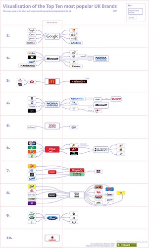
Top 10 UK Brands 2007 Visualisation


Top 10 UK Brands 2007 Visualisation, originally uploaded by visual think map.
Inspired by the infographic "Who Owns the Car Companies" that I originally posted about in October 2007, Chris Watson, from Visualthinkmap.blogspot.com, has created a cool infographic showing the owners for some of the top brands in the UK.

Great job Chris!

Wednesday, July 2, 2008

Map of Local Gas Prices


GasBuddy.com has a cool interactive temperature map of gas prices across the U.S. and Canada that allows you to zoom in to the street level to see prices at specific gas stations.  Prices are all removed from the database when they become over 72 hours old to keep the map current.


Thanks for sending in the link Karen!