Tuesday, December 29, 2009

Cool Infographics has Moved!


You will be automatically redirected to the new site.

Please update any links and bookmark to http://coolinfographics.com

Pardon my dust - Cool Infographics is changing

Please accept my apologies for any problems you may have reading Cool Infographics for the next few days.  I'm taking some time over the holidays to move the Cool Infographics blog to a new host, since traffic is really low during this time.

What you, the reader, should expect from the new site:
  • The URL, www.coolinfographics.com, will stay the same.  You don't need to change your bookmarks at all (unless you're still using the old URL: coolinfographics.blogspot.com).
  • If you use an RSS reader, that will stay the same also, so no changes should be necessary
  • With the new site, I'll be able to offer some additional value-added services like an updated design, an infographics job board, how-to design infographics features,  an infographics bookstore, infographic software and links to infographics posters available for purchase.
You feedback on these changes is very welcome.  So please feel free to use the contact page in the new site design to let me know what you like or don't like.

Visualizing Gravity Wells - infographic comic


Another great new infographic comic from xkcd.com.  A mix of real science and humor, this one plays on the words "gravity well" by visualizing the strength of each planets gravity as the depth of a crater scaled to Earth's surface gravity.
The chart shows the "depth" of various solar system gravity wells.
Each well is scaled such that rising out of a physical well of that depth - in constant Earth surface gravity - would take the same energy as escaping that planet's gravity in reality.
Click on the image to go to the xkcd.com site to see the high-resolution version.


Thanks for sending in the link Ruben!

Monday, December 28, 2009

Higher Education = Lower Unemployment


From USCollegeSearch.org, a fairly simple but good chart showing the relationship between unemployment rates and education levels.  Although lacking a good title, this chart does a great job of communicating one message really well.

The Bureau of Labor Statistics has found that people who finish degree programs in college earn much more over the course of their lifetimes than those who only earn high school diplomas or drop out of college. Sometimes the difference can be over a million dollars before retirement.  But even more interesting, it was noted that people with undergraduate and graduate degrees manage to stay employed for longer periods, but also find jobs they qualify for more quickly.  They spend less time searching and more time working.

Thanks Jim!

Friday, December 25, 2009

Christmas by the Numbers!


BillShrink.com presents this holiday infographic, Christmas by the Numbers, visualizing the decline in holiday spending in the U.S. and some other fascinating holiday figures.  Click the link to see the high-resolution version.
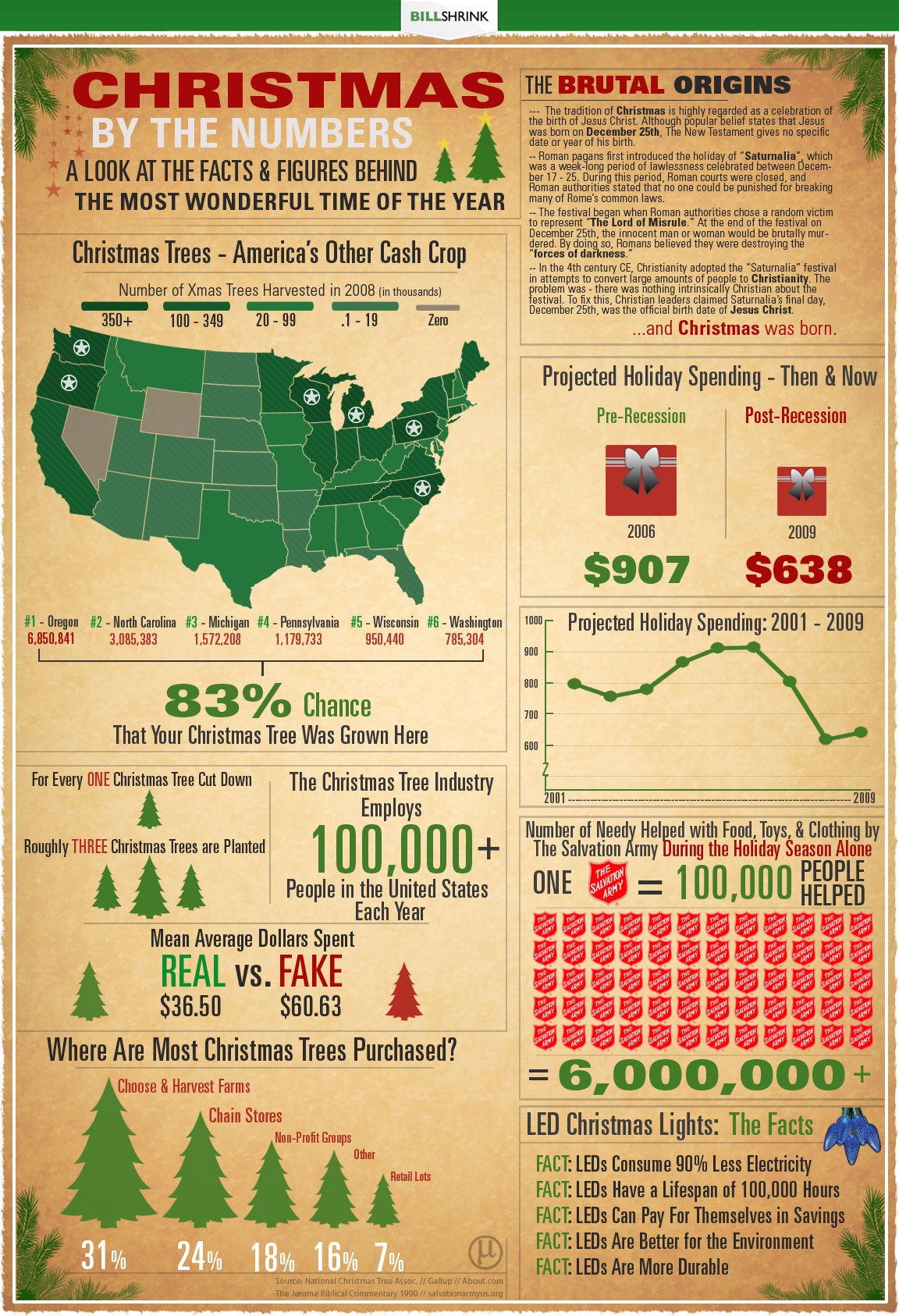
‘Tis the season for Christmas trees, lights and gifts, and in the past that has also meant the season of outrageous spending. While the holidays may not be cheap, hard times sometimes call for desperate measures and drastic budget changes. Here’s a look at the hard facts and numbers of this most wonderful time of the year.
Merry Christmas from Cool Infographics!

Thursday, December 24, 2009

The Holiday Economy


Our Present Economy is a look at holiday spending from 1997-2007 with some specifics about 2007.  It doesn't say explicitly, but I believe this is for the U.S. only.  From GOOD Magazine, this Good Sheet was available at Starbucks during the holiday season in 2008.

I wonder how 2009 compares?

Tuesday, December 22, 2009

Holiday Cliché Find-It Graphic from Xplane.com


Check out this fun Holiday Cliché Find-It graphic from Xplane.com!  It's available as a 11x17" sized PDF so you can view or print it out.

“Get your ducks in a row” so that you aren't “caught with your pants down” this holiday season! After all, it can be like “herding cats” out there this time of year, and you definitely don't want to get stuck “in the weeds.” So, go ahead and take a minute to “shop this around,” “see if it sticks” and celebrate from a “10,000-foot view.” It's all “blue sky” from here on out, nothing but a “win-win situation!”
Think you know your business clichés? Find where they're hiding in this holiday XPLANATiON™ created by your friends at XPLANE! Just click the image above to download the tabloid-sized 11x17" PDF.
Thanks to Parker at Xplane.com

Monday, December 21, 2009

Infographic Posters for Data Lovers

Both Infosthetics.com and Datavisualization.ch have posted great stories about what to give the data lover in your life for Christmas.  From books to posters to software to conferences.  Please visit those sites to get the whole list of ideas, but here I'd like to present a few of my favorite posters made by the friends of Cool Infographics.  Just click on the images to be taken to somewhere you can purchase these.

Posters:


The History of the Supreme Court of the United States
from Nathaniel and Frank at TimePlots.com


Death & Taxes
from Jess at WallStats.com


Two posters: "Cities of Champions" and "The Taxonomy of Team Names"
from Jeremy at InfoJocks.com


Web Trend Map 4


The Conversation Prism 2.0
from Brian Solis and Jesse (Jess3) at theconversationprism.com

Friday, December 18, 2009

Word Spectrums! The Online Infographic Battleground


On Chris Harrison's site, there are a number of graphics that he calls Word Spectrums.  More like a battleground, Chris is using the enormous amount of data from websites that has been made public by Google.  This is an advanced form of a word cloud that visualizes related words and their relative connections to the two topics.  (FYI, since this is based on raw Google data, foul language does appear in some of them).


Using Google's enormous bigram dataset, I produced a series of visualizations that explore word associations. Each visualization pits two primary terms against each other. Then, the use frequency of words that follow these two terms are analyzed. For example, "war memorial" occurs 531,205 times, while "peace memorial" occurs only 25,699. A position for each word is generated by looking at the ratio of the two frequencies. If they are equal, the word is placed in the middle of the scale. However, if there is a imbalance in the uses, the word is drawn towards the more frequently related term. This process is repeated for thousands of other word combinations, creating a spectrum of word associations. Font size is based on a inverse power function (uniquely set for each visualization, so you can't compare across pieces). Vertical positioning is random.


Chris has created and shared a number of different versions on the Word Spectrum page of his website, and you can see high-resolutions PDFs of each there.

Want to try your own?  Building on Chris' idea, Jeff Clark from Neoformix has created interactive Word Spectrums using either Twitter or News as the source that lets you enter your own terms to compete.  I especially like the idea of pitting two competing brands against one another.


Thursday, December 17, 2009

The Simpsons 20th: Comedy [Family] Tree


The Simpsons celebrate their 20th anniversary this week on Thursday, and CNN Entertainment published this chart "The Simpsons Comedy Tree" on Monday.  A combination Nightingale Rose Graph (also called a polar area diagram), family tree and timeline, this simple chart connects the influences that impacted Matt Groening and the creators of the Simpsons as well as the shows that came after.
"The Simpsons" stands on the comedic shoulders of many that came before -- and has influenced countless works that have arrived since. Here are just a few of the roots of the "Simpsons" comedy tree and the branches of those it gave life to. (The following, illustrated by the doughnut at the top of the story, is by no means complete, and each member has its own, sometimes overlapping influences.) 
Thanks to Tony Hendra's "Going Too Far" for inspiration and cartoonist Art Spiegelman for having his fingerprints all over the place.
The article also includes descriptions of the actual influence for each of these shows.

Thanks for the link Matt!


Also:


For those Simpsons fans of you, here is also the poster created exclusively for Entertainment Weekly celebrating the release of the 20th season DVD set on Jan 12.  Dude, make sure to go look at the large, scrollable version.

Wednesday, December 16, 2009

FREE Infographic Holiday Cards!


Once again this year, Funnel Inc. is offereing a free set of Holiday Infographic Cards to anyone who registers on their mailing list "while supplies last!"  You won't find the link on the main website, but here is the link for readers of Cool Infographics.


Also, there are four FREE Holiday desktop infographic images available on the same page at various resolutions.


Thanks to Lin at Funnel Inc. for keeping the link up for my readers!

Saturday, December 12, 2009

My Digital Life - personal infographic


My Digital Life, is an quick infographic by me!  A mindmap or network map of the digital products in my life, and how they all interconnect. Each connection is color-coded by the connection type (USB, wireless, ethernet, etc.) including its respective standard icon.  High-res version is on Flickr.

This started as a simple sketch to help me determine how to add a new external hard drive I got on Black Friday, but it quickly became much more fun to see how far out I could push the network.  I already know of some more that I want to add, so someday there may be a 2.0 version.  Apparently, I could use an IT manager at home.


I did ignore some differences within the connection types to keep this fairly simple.  I don't distinguish between USB 1.1 and USB 2.0 connections.  I use "Display" as a connection type, but its a DVI connection for the MacBook, a HDMI connection from the AppleTV and a composite connection from the DVD player.  I also show only one "Wireless" connection, but I know that the iPhone only uses 802.11g and the laptop uses 802.11n.

I did this using OmniGraffle, with a little help from Pixelmator and Keynote to clean up the images.

Friday, December 11, 2009

Send your own Augmented Reality Christmas Cards!


Merry Christmas from Cool Infographics!

What better way to share your Christmas wishes than with augmented reality?!?  You can send your own AR Christmas cards courtesy of arwishes.com.  You can choose from an assortment of animated images that will appear on screen when you friends and family hold up your Christmas card in front of their computer's webcam.


The cards are printed with the marker, disguised as a holiday image.  In this case, the marker is obviously the Christmas Tree.

A number of companies did this last year, sending out cards with an AR marker printed as part of the card, and a number of them are still online.  You can also print out a card from the sites to see the image yourself.  There will probably be a few more this holiday season as well, but here are some videos from last year's AR cards and links to sites if you want to experience them yourself.

Specialmoves.com:


Special Moves Augmented Reality Xmas Card from Iain Tait on Vimeo.


TellArt:


Tellart 2008 Holiday Card from Tellart on Vimeo.


Stella Artois:


Total Immersion:


There's even a video of sending your own AR Christmas Cookies!

Thursday, December 10, 2009

The Carbon Economy - Infographic Video


New infographic video from Xplane.com.  The Carbon Economy takes a look at the political landscape around climate issues and new, green markets are emerging.
Created with The Economist, the video conveys the state of global climate change and what steps must be taken to reach a positive outcome. The piece was shown at The Economist's recent Carbon Economy Summit in November 2009.
Timed with the publication of a special report in The Economist, The Carbon Economy summit examines how the political environment has changed since Kyoto and how committed regions and industries are to a sustainable carbon strategy.

Wednesday, December 9, 2009

Bill Nye Videos on the Scale of the Solar System


Two videos from Bill Nye the Science Guy showing the size and scale of the planets and the Sun.  He may have done similar examples, but these are the two I know about.  The one above (Planets & Moon) starts at about 4:00 into the video, and the one below (Outer Space) starts at about 2:00.  "Outer Space is HUGE!"


Thanks to @DannyDougherty on Twitter for sharing!

The Origins and Paths of Epidemics


This world map shows the origins and spreading paths of Malaria, Leprosy and Small Pox. No legend, but the implication is that as the main arteries diminish in width down to small capillaries represents the number of infection cases.  Key dates and locations are also identified with event description.

There is no designer byline on the graphic, but map is credited to Haisam Hussein.  I don't see the map in the gallery on Haisam's website, but he is given credit for the map on Lapham's Quarterly.

Found on digg.com.

Tuesday, December 8, 2009

Infographic Coins!


What a great infographic product design idea!  From designer Mac Funamizu on his site, PetitInvention, Infographic Coins that use the physical analogy of a pie chart to help consumers figure out the currency, especially when visiting a foreign country.  You have to ignore some of the benefits of all round coins, but the idea is spot-on.  Feeling in your pocket, you could almost always pull out the right coin.


The round shaped coins must have a lot of benefits that other figures such as a triangle or a square don’t. Also, non-rounded coins may have many demerits. Aside from those, travelers and other people who are not accustomed to the currency would be able to easily remember how much each of these coins is (as long as she knows how to read pie charts).


Monday, December 7, 2009

A Visual History of the Supreme Court - New Infographic Poster!


Today, I want to share the launch of Timeplots.com.  A new infographic site focused on designing visual timelines by Nathaniel Pearlman and Frank Hamilton.  The Timeplots.com site launched today highlighting their first project; a poster called "A Visual History of the Supreme Court of the United States".
This large-scale (48″x32″) print displays the full sweep of American federal judicial history from 1789 to 2009. It combines biographical information on every Supreme Court justice with a visualization of the influence of U.S. presidents and their political parties on the Court over time, and includes vote counts and summaries of landmark cases.
Months of work went into researching the history of the Supreme Court, and that effort really shows through in the level of detail in this poster.


It's a good thing they offer this as a large format poster, because the detail draws you closer to discover the events and landmark decisions that are the colorful history of the SCOTUS (Supreme Court of the United States).


I love that even on their About page, they created small, infographic timelines as a visual of their individual experiences and career histories.  Here's Nathan's:


Timeplots has also started a new service, Timeplots on Demand:
Timeplots’ dedicated staff is ready to work directly with you to honor your own organization—your company, school, nonprofit, team, church, or family—with a custom Timeplot of your institution’s history. Let us help you collect data, create memorable images, and visualize the developments of your institution.
Congratulations to both Nathaniel and Frank!

Scale Model of the Solar System


The Scale Model of the Solar System (from phrenopolis.com) shows both the relative sizes of the planets and the Sun as well as representing the distances from the Sun on the same scale.  This image is huge (just over half a mile wide), and as you can imagine mostly black.
This page shows a scale model of the solar system, shrunken down to the point where the Sun, normally more than eight hundred thousand miles across, is the size you see it here. The planets are shown in corresponding scale. Unlike most models, which are compressed for viewing convenience, the planets here are also shown at their true-to-scale average distances from the Sun. That makes this page rather large - on an ordinary 72 dpi monitor it's just over half a mile wide, making it possibly one of the largest pages on the web. This means you'll have to do a bit of scrolling if you want to find the planets, but don't despair. They are reasonably bright and labeled, so you can probably catch them flashing by in the blackness even if you are scrolling fairly fast.
Found on Information Aesthetics.

Friday, December 4, 2009

Enter the "Visualize The BCS" Infographic Contest! #BCSvisual


Think you can design an infographic?  Well now's your chance to prove it!

Announcing the "Visualize the BCS" contest from InfoJocks.com!  The Bowl Championship Series causes a ton of debate between sports fans over the holidays.  We want you to design an infographic about the BCS.  What to visualize is completely up to you, but must meet two criteria: 1) relate to the BCS and 2) use statistics.  Should be easy, right?

Prizes:  Three winners. Best Entry gets two posters of their choice and a $50.00 gift certificate to ESPN’s online store. And to keep it interesting, Most Artistic Entry and Most Analytical Entry both receive posters as well. All entrants with legitimate entries will receive a free set of our Taxonomy of Team Names gift cards.

Of course, I will post the winners here on Cool Infographics and maybe more of the entries as well.

Deadline:  All entries are due January 1, 2010. The winner will be selected before the National Championship is played. Send your entry in PNG, JPEG, or PDF format to contest@infojocks.com, along with your mailing address.

Visit the InfoJocks.com blog for complete details and some ideas.  Jeremy will be posting some links to possible resources and datasets next week.

Spread the Word!  Also, from Cool Infographics you can win a free poster by helping us spread the word.  Tweet about the contest on Twitter with a link back to this post and include the hashtag #BCSvisual.  On December 21st, I'll use a random number generator to pick a random qualifying Tweet and send you a free poster from Infojocks.  (only one Tweet per person will qualify)  An example Tweet would look like this:
Enter the "Visualize The BCS" infographic contest by Infojocks and Cool Infographics!  #BCSvisual http://bit.ly/8Fo4Ii


Remember, everyone who enters will receive a FREE set of Taxonomy of Team Names gift cards.

Thursday, December 3, 2009

Sports Infographic Poster Deal from Infojocks!


Jeremy over at Infojocks is offering a special discount deal for the holidays: Buy one poster, and get the second poster for half price!  (offer good through Friday, Dec 11th).  That's any two posters from his store for $30!  Choose from "Cities of Champions", "Taxonomy of Team Names" or "Road to the Stanley Cups".

For readers of Cool Infographics to take advantage of the deal, go to the Infojocks store.  No promotion code necessary, the discount will be automatic when you add two posters to your shopping cart.

Infojocks.com is a great site by our friend Jeremy Yingling who designs and produces infographic posters covering sports related topics.  Great gifts for the sports fan on your Christmas list!

Wednesday, December 2, 2009

Ebay Visualizes Black Friday 2009 - Interactive infographic map


From ebay, a map of the transaction activity on Black Friday 2009 (the shopping day after Thanksgiving).  1 million transaction are mapped in the U.S. over the course of the day!
Activity Level Indicator The color of the point on the map indicates the number of transactions that occurred in the corresponding area.
Data Execution This transaction map was created as a study of the extensive activity that occurs in the eBay Marketplace on the biggest offline shopping day of the year. It is a visualization of all U.S.-based buyer and seller transactions on eBay on Black Friday, November 27, 2009 (12:00:00 AM to 11:59:59 PM EST). Although eBay is an international marketplace, this map is focused on U.S. data, as Black Friday is the traditional beginning of the holiday shopping season for the U.S.
It's an interactive, animated timeline, so you can watch the transactions grow throughout the day and zoom in to specific areas of the country by clicking on the map.  It's a flash animation, but there's a WMV movie file available for download too.

They also did a map of the even bigger 1.4 million transactions on Cyber Monday 2009.

Found on VizWorld


Tuesday, December 1, 2009

Vote With Your Dollars! - Corporate Political Contributions infographic


Vote With Your Dollars, is a corporate political contributions map.  Using the public data from the Center for Responsive Politics (2004-2008), GoodGuide.com has plotted the balance of contributions from companies.  Mouse-over a specific company logo to see the detailed data (like Dell above).
View the political contributions of your favorite companies and see how you vote with your dollars.  The data is surprising!
You can choose specific companies or business sectors, and then change the sort order.  Here is the retail sector sorted by Most Democratic Leaning:


Thanks Anthony for sending in the link.  Sorry it took so long to get posted.

Friday, November 27, 2009

Black Friday Deal! 3-for-1 posters at Flowing Prints


Nathan over at FlowingData and FlowingPrints is offering a special 3 posters for the price of 1 deal for Black Friday (offer good through Sunday 11/29).  That's all three posters for $20!

For readers of Cool Infographics to take advantage of the deal, go to FlowingPrints, click on the "Buy The Series" button and use the promotion code: bfridayfps20

The three posters all focus on Education, titled "College High", "Education: Enrollment and Dropouts" and "How America Learns: by the Numbers".  If not for yourself, think about buying a set for your local school or library!
The state of education in America is the theme of this series. With funds getting cut nationwide, it's important to know how today's youth are learning (or not learning).  We looked at over three decades of data from the National Center for Education Statistics (NCES). Education has seen a lot of improvement over the years, but there is still plenty of room for growth.
Also, for every print you buy, Nathan will send an additional one to a local school too!  Thanks Nathan!

Wednesday, November 25, 2009

Cool Infographics on the Amazon Kindle!


The Cool Infographics RSS feed is now available as a subscription for the Amazon Kindle!

It downloads the new blog posts wirelessly through the Amazon Whispernet network so you can view them anytime, even when you're not connected to the network.  It looks pretty good for being in black & white.  You do get to see the images I post on the blog, but you have to come back and view them on your computer to get the full color images.
Kindle Blogs are auto-delivered wirelessly to the Kindle and updated throughout the day. They are fully downloaded onto your Kindle so you can read them even when you're not wirelessly connected. And unlike RSS readers which often only provide headlines, blogs on Kindle contain full text content and most images.
I  just figured out that this was even possible.  Amazon sets their own price, which they have set at $1.99 per month for some unknown reason.  I do get a very small piece of that, so subscribing does support the Cool Infographics blog.

To give credit, I saw the link on Matthew Hurst's Data Mining blog.

Florence Nightingale: Causes of Mortality infographic from 1858!


Yes, from that Florence Nightingale (1820-1910), and it's from 1858!  The polar area diagram is also known as the Nightingale Rose Graph.

From Wikipedia,
This "Diagram of the causes of mortality in the army in the East" was published in Notes on Matters Affecting the Health, Efficiency, and Hospital Administration of the British Army and sent to Queen Victoria in 1858.


This graphic indicates the number of deaths that occured from preventable diseases (in blue), those that were the results of wounds (in red), and those due to other causes (in black). 
The legend reads: 
The Areas of the blue, red, & black wedges are each measured from the centre as the common vertex. The blue wedges measured from the centre of the circle represent area for area the deaths from Preventable or Mitigable Zymotic diseases, the red wedges measured from the centre the deaths from wounds, & the black wedges measured from the centre the deaths from all other causes. The black line across the red triangle in Nov. 1854 marks the boundary of the deaths from all other causes during the month. In October 1854, & April 1855, the black area coincides with the red, in January & February 1855,(*) the blue coincides with the black. The entire areas may be compared by following the blue, the red, & the black lines enclosing them.
Also from Wikipedia:
Florence Nightingale had exhibited a gift for mathematics from an early age and excelled in the subject under the tutorship of her father. Later, Nightingale became a pioneer in the visual presentation of information and statistical graphics. Among other things she used the pie chart, which had first been developed by William Playfair in 1801.
Florence Nightingale is credited with developing a form of the pie chart now known as the polar area diagram, or occasionally the Nightingale rose diagram, equivalent to a modern circular histogram to illustrate seasonal sources of patient mortality in the military field hospital she managed. Nightingale called a compilation of such diagrams a "coxcomb", but later that term has frequently been used for the individual diagrams. She made extensive use of coxcombs to present reports on the nature and magnitude of the conditions of medical care in the Crimean War to Members of Parliament and civil servants who would have been unlikely to read or understand traditional statistical reports.
In her later life Nightingale made a comprehensive statistical study of sanitation in Indian rural life and was the leading figure in the introduction of improved medical care and public health service in India.
In 1859 Nightingale was elected the first female member of the Royal Statistical Society and she later became an honorary member of the American Statistical Association.
Found this while reading the great FlowingData post "9 Ways to Visualize Proportions – A Guide" by Nathan Yau.

KXVTA2R4XWE3
FRJK52DWMBJQ

Monday, November 23, 2009

Probes in the Universe - cool interactive infographic


Space Probes is a very well-done interactive graphic about all of the space probes we have launched, visually placing the probes in orbit around the object they are observing.  You can move around the 3-D space with the keyboard controls, change the date range with the sliders on the bottom or go directly to a particular probe from the list on the right that is group by planet or object they are around.  When you mouse-over a particular probe you get more details and an image.


The article and the infographic are in Portuguese from Brazil, so I took the liberty of using the Google Translator for a little help.
The infographic "Space Probes" Super, produced by the team of Internet Editora Abril Jovem, took the silver medal in the category Online Malofiej, top prize in the world of computer graphics.
Thanks to Daniel for the link and a little more information:
It won Malofiej's silver medal (first place, no gold medal) this year. 
It's an infographic about all space probes launched until the date it was published (except Earth probes, which are too many). The info has information about each probe, including the organization(s) that sent it, the target planet(s) (or moons, asteroids, comets and the sun), launch date and mission details, as well as pictures for most of them. User can navigate through our Solar System using the mouse and/or keyboard. It's also possible to know the details of Mars Science Laboratory, the next NASA probe to visit the red planet. The info is in Portuguese, but anyone can understand it's features and learn a little bit about space exploration so far.

Thursday, November 19, 2009

Cool Infographics 2.0 BETA


Exciting things are happening around here!  Watch closely in the next couple of weeks for a bunch of changes to Cool Infographics!  I'll also post about the changes as they happen on Twitter.

Step 1: Cool Infographics now has a new URL address:  www.coolinfographics.com
Please change your bookmarks to the new address.  The old URL address, coolinfographics.blogspot.com, will keep working for a few weeks, but eventually will go away.
If you use an RSS reader, nothing changes.  The RSS feed doesn't change so you don't have to do anything.

Step 2: Watch for the design changes in the next few weeks (like the new logo above!).  I've got some big plans for Cool Infographics.

Sounds easy with only two steps doesn't it?  That's because I get to do all of the work.

Thanks to everyone for reading and subscribing!

Motionbox PRO discount & Roku Box Giveaway


Motionbox is an online service to share video content that allows you more control over who can view your content.  They are also a video hosting service that allows you to embed video on your own site with a clean, "white label" player without any watermarks, ads or branding from the video site (like YouTube, Vimeo, etc.)

  classid="clsid:D27CDB6E-AE6D-11cf-96B8-444553540000"   codebase="http://download.macromedia.com/pub/shockwave/cabs/flash/swflash.cab#version=6,0,40,0"   width="416"   height="312"   id="mbox_player_7a9fd8b41c11eec6f5">                       width="416"       height="312"       name="progressive_player"       allowscriptaccess="always"       allowfullscreen="true"       data="http://player.motionbox.com/VideoPlayer.swf?"       type="application/x-shockwave-flash"       flashvars="video_uid=7a9fd8b41c11eec6f5&security_token=prod3.e05cc924932ecddb&type=hd"     >          

To watch the video, you'll first need to  install the flash player.

     
'
  

NOVEMBER GIVEAWAY: Anyone who signs up for a free account in the month of November (one week left!) can enter into the giveaway of 3 Roku HD players.  If you're not familiar, the Roku Box connects to your TV and allows you to stream video from the Internet to you TV, including HD content.  Official Rules are here.
All you have to do is sign up for a FREE Motionbox account before November 30, 2009 then email offers@motionbox.com with subject line "Roku Giveaway" and we'll enter your name for a chance to win a Roku HD  Player. 


Also, for any readers interested in signing up for the PRO account, the $50 setup fee will be refunded.  Once you’ve set up your account, send an email to offers@motionbox.com with offer code PROblogger2009 and they will set up your refund.

A special gift for you and your readers: From now until the end of the year, sign up for a Motionbox PRO account, and we’ll refund your $49.99 set up fee! 
Motionbox PRO provides small businesses, pro bloggers, and commercial content producers with a comprehensive video hosting solution. PRO service includes archival storage, web-based editing, streaming and embedding, all in superior quality, up to 1080p HD.

Thanks to Lowell for setting this up for readers of Cool Infographics!