Wednesday, January 30, 2008

Superior Coffee


Another one from Beau and Alan Daniels at beaudaniels.com that I really liked. Superior Coffee is half blueprint, half illustration that helps communicate the Superior Coffee strategy of delivering a better coffee to customers and is used at trade shows. A good way to visually show the technical aspects behind a product.

Tuesday, January 29, 2008

Golf Terms Explained


Humorous infographic that visually explains some of the common golf terms from Beau and Alan Daniels at beaudaniels.com, where you can find a number of good examples of their infographic work.

Sunday, January 27, 2008

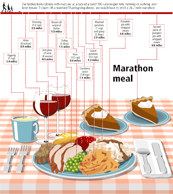
The Marathon Meal


You have to walk 26.2 miles (a complete marathon!) to burn off the calories from a standard Thanksgiving meal, shown here broken down by each dish included. That extra piece of pumpkin pie is worth 5 miles!

This infographic is from Gary Newman Design, who does some fantastic work.

Clarifying Cloning


From The Genetics and Public Policy Center, an infographic demonstrating the difference between research cloning and reproductive cloning.

Saturday, January 26, 2008

Do's and Don'ts with Babies


A series of infographics to help the parents of a new baby...sort of. Some of these are very funny, but some of them are very odd.

These are apparently a series of images from the book Safe Baby Handling Tips, by David and Kelly Sopp.

Tuesday, January 22, 2008

Nichloas Felton's 2007 Annual Report


Nicholas Felton has published his new 2007 Annual Report. I love the way he breaks down his own personal life into maps and charts. I had just posted about his 2006 Annual Report last month.

Monday, January 21, 2008

Harnessing the Wind


From the Telegraph in the UK, the idea is to use a kite to help pull a ship across the ocean. by using the wind power at high altitudes the ship would save on energy consumption.
Its inventor, Stephan Wrage, a 34-year-old German engineer, claims the kite will significantly reduce carbon emissions, cutting diesel consumption by up to 20 per cent and saving £800 a day in fuel costs.
Found on digg.com

Sunday, January 20, 2008

Race to the Moon


Cool poster I found over at historyshots.com shows the altitudes reached by all of the U.S. and Russian launches leading up to the 1969 moon landing.
From 1961 to 1969 the USSR and the United States were locked in a history-making race to land the first person on the moon. This detailed map explains the story of this titanic contest in a clear and informative manner.

Thursday, January 17, 2008

Map of European Languages


This is a great map, found on Photobucket.com uploaded by the user pizzler. In the U.S. we understand that other countries sometimes speak foreign languages, but we have the advantage that all 50 states speak the same language (or at least a similar version of the same language). So it's somewhat of an abstract concept to most Americans. And European geography isn't exactly a major topic in the U.S. school system, so most people don't understand how many countries there are, and especially how small some of them are.

This visual map really helps convey the diversity within the EU. It maps 46 languages across the European continent, and I know there are more. I can't imagine how difficult it must be for the EU to actually get anything done between countries.

Wednesday, January 16, 2008

The Price of Gasoline

This image was real popular on Digg.com this week. It's hosted on tinypic.com, but there's no author listed.

I love simple infographics like this that use a visual metaphor to instantly get the point across. You can tell someone that the price of gas is comparable with Coke, but putting gas in the Coke signature bottle will get more people to understand the message.

My own reaction was probably the opposite of what the author intended. My first thought is "Coke costs how much?!?" I know there is a lot more expense in producing gasoline than there is in producing Coke. They must really be marking the price up a lot for brown sugar-water.

There is a similar analogy in the U.S. regarding bottled water. Some bottled water brands are now more expensive than gasoline! How is that possible?!?

Corporate Connections


I found reference to this graphic by Zohar Manor-Abel on smashingmagazine.com.
What is the connection between 3 celebrities, 35 corporations, 40 subsidiaries and more than 300 brands? Global business interests make up a complex network of connections between corporations from around the world. Corporate Connection, intends to shed light on 'who owns what' in the lobal marketplace and on the intricate nature of the world wide "business" web.

Thursday, January 10, 2008

Digg These Pics


Really cool new feature over on Digg.com. Back in late 2007, they added an Images category so users could digg their favorite pictures. Now they've added an interactive image viewer in the Digg Labs that lets you see new images and pictures being dugg in real-time.

The only thing I don't like is that it doesn't let you add any search terms. You have to see all of the activity, and can't narrow it down it all.

Tuesday, January 8, 2008

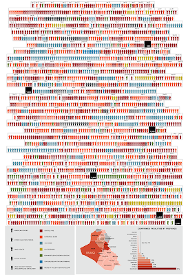
One Year in Iraq


New infographic from nytimes.com depicting the 2,592 deaths in Iraq over the course of the entire year of 2007. The graphic is credited to Alicia Cheng, a graphic designer at mgmt. design in Brooklyn.
The chart below — compiled from data provided by the American and Iraqi governments and news media organizations (the independent Coalition Casualty Count in particular) — gives information on the type and location of each attack responsible for the 2,592 recorded deaths among American and other coalition troops, Iraqi security forces and members of the peshmerga militias controlled by the Kurdish government.

I think this is an improvement over the "31 Days in Iraq" graphic because the new graphic identifies every death as a separate figure instead of grouping some together. There are also some differences in data, as the new graph doesn't include the Iraqi civilian deaths. So the "31 Days in Iraq" graphic showed over 1,900 deaths in January 2007, this new graphic only shows 163 deaths in January.
And, sadly, civilian fatalities in Iraq last year were simply too numerous to represent on a single newspaper page.

I'll keep an eye out in early February to see if they publish one for the month of January as they have the last couple of years.

Monday, January 7, 2008

The Software Wars


Found originally on Digg Images, this one is hosted on Steven Hilton's website (the author).


I guess you could call this a Mind Map style, but it's more like a Battlefield style infographic. I really like how it shows the products that multiple competitors are challenging Microsoft with and the associated product on the Microsoft side that is being challenged.

Sunday, January 6, 2008

Cool Color Fading Calendar


I don't think this is an actual product, but a concept from the mind of designer Shi Yuan
from his website. The ink is light sensitive, so it fades slowly over the course of a day, eventually disappearing by the end of the day.

Found on Sawse

Saturday, January 5, 2008

The Japanese Wii Safety Manual is Crazy


Gizmodo posted a number of the crazy images from the Japanese version of the Wii safety manual. These are hilarious!

Wednesday, January 2, 2008

Savvygraph your Amazon product searches


I can't tell if Savvygraph.com is part of Amazon.com, or if this is a separate company running this. It takes any Amazon.com search terms you enter and charts the results on an X-Y chart showing the Average Rating and the total Number of Ratings.

It's fairly interactive. You can limit the price range using the sliders at the top, and when you hover over any of the pins you get the product image. Clicking on the pin takes you to that item on Amazon.com. Clicking on any of the links on the right limit the search to a smaller subset based on your choice (like a particular brand).

EDIT: I did receive an email from the author who confirmed that the site is totally separate from Amazon.com. Thanks Dave.

Tuesday, January 1, 2008

Smoking Kills 200,000 Every 6 Months


Skull With Cigarette, 2007 [based on a painting by Van Gogh]
72x98"

Depicts 200,000 packs of cigarettes, equal to the number of Americans who die from cigarette smoking every six months.

I've become a big fan of Chris Jordan's work, especially the Running The Numbers series. I just noticed that he has added to the collection on his website with some new pieces! A friend of mine quit smoking this week, so in her honor I want to share one of the new artwork pieces.