Showing posts with label flowchart. Show all posts

Wednesday, November 18, 2009

Visual Map of 30 Free Online Promotion Websites


Great visual map of the connections between free online sites to promote your content.  Made by Chris Watson at Visualization Magazine.
This visualisation was made to help inform and advertise on how easily and effectively you can use the web 2.0 tools to build an online presence through free sites, feeds, embed and monitor progress/stats.
Chris also has links to all of these icons in his post in case you want to create your own Web 2.0 visual.

Monday, October 12, 2009

How to Crack a Master Lock [infographic]


Designed by Mark Edward Campos, this infographic takes the confusing instructions that have been on the Internet for years, and translates them into a simple graphic.  64,000 possible combinations reduced to less than 100 attempts.
This design project was born to understand the inner workings of the padlock, and to develop a notation system to engage the viewer and provide a guide to beat a pad lock.
Found on Gizmodo.

Tuesday, August 25, 2009

U.S. Energy Use Decreases in 2008 [infographic]


Infographic from the Lawrence Livermore National Laboratory, this is their estimate for the total U.S. Energy Consumption for 2008.  Although not depicted in the graphic, their estimate for energy usage dropped by 2% from 2007 to 2008, and use of alternative energy sources like wind and solar increased.

Found on CleanTechnica.com

Estimated U.S. Energy use dipped in 2008 to 99.2 quads (quadrillion BTUs), down from 101.2 quads in 2007. Energy flow charts show the relative size of primary energy resources and end uses in the United States, with fuels compared on a common energy unit basis. The amount of energy in one quad is equivalent to that produced by the burning of 36,000,000 tonnes of coal.

Thursday, March 5, 2009

Chart Chooser


A quick reference guide (in the form of a mind map) by Andrew Abela on choosing the right type of chart for the type of message you are trying to communicate with your data.

Found on Digital Inspiration

Wednesday, January 28, 2009

The Ultimate Mammal Family Tree


This is very cool.  Going back 166 million years to see each of the branches where we share common mammalian ancestors.  The PDF is available for download, and is very detailed.  You need to zoom a long way to even see that there is text naming each of the known mammals in existence today.  It's a radial family tree that also represents a timeline as you move outwards from the center.  Here we are:


ABC TV in Australia did a short video on the family tree hosted by Dr. Paul Willis, and he literally walks around the infographic describing different parts.  Well done, and seemed very reminiscent of Carl Sagan in some of his shows.  The video credits Robin Beck, a Mammalian Systematist as the University of NSW, of creating the family tree.  Here's the link to the ABC page where you can watch the video, or you can click on the image below.


Thanks for the link Alwyn!  Great find!

Tuesday, January 27, 2009

The Life of a Web Article


Great infographic from the team at Eliiance.com showing how web content (articles) gets from publishing to actual consumption by online viewers.

Friday, December 12, 2008

The Nuclear Express


From NYTimes.com, this graphic is a summary of the proliferation of nuclear weapons based on the new book "The Nuclear Express: A Political History of the Bomb and Its Proliferation" by Thomas C. Reed and Danny B. Stillman.  The graphic is part of the NY Times article titled "Hidden Travels of the Atomic Bomb".
"The Nuclear Express" a new book on the history of the atomic age, describes the interlocking web of influence and espionage behind the proliferation of nuclear technology.  This diagram gives a summary of the authors' tracking of the transfers of nuclear technology and secrets.
Thanks Jesse for sending in the link.

Saturday, November 29, 2008

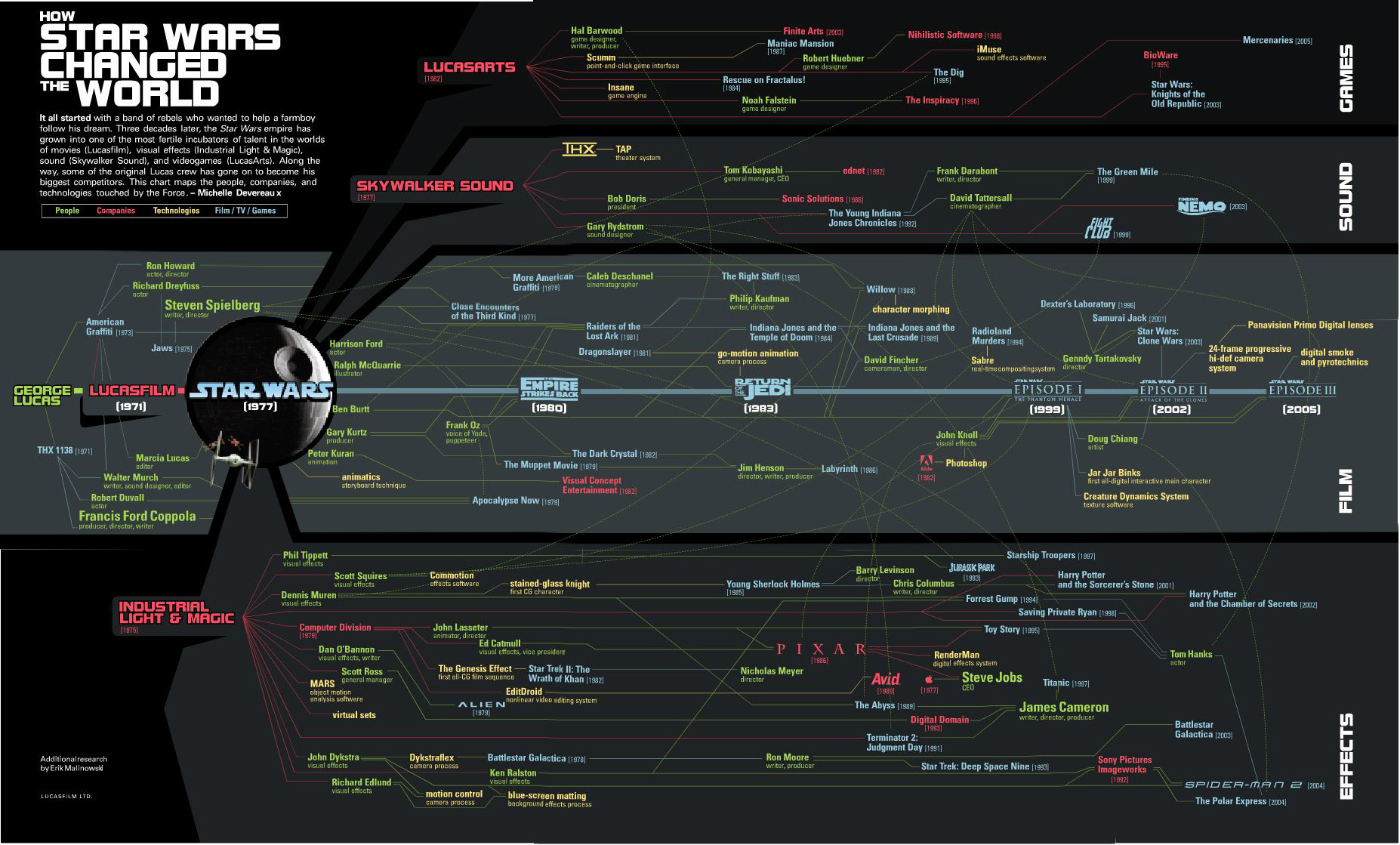
How Star Wars Changed the World


The original Star Wars has certainly gone on to produce more than just sequels.  It has created the people and the technologies that are now considered the best in the industry.  Michelle Devereaux created this family tree for Wired magazine back in 2005 and I love how the line colors indicate people, technologies and company connections, but the tree is organized into movies, sound, effects and technologies.

I actually believe the tree is incomplete.  I think Star Wars had far greater reach and influence that what Michelle mapped out here.
It all started with a band of rebels who wanted to help a farmboy follow his dream.  Three decades later, the Star Wars empire has grown into one of the most fertile incubators of talent in the worlds of movies (Lucasfilm), visual effects (Industrial Light & Magic), sound (Skywalker Sound), and videogames (LucasArts).  Along the way, some of the original Lucas crew has gone on to become his biggest competitors.  This chart maps the people, companies and technologies touched by the Force. - Michelle Devereaux
Thanks Alwyn!

Monday, November 17, 2008

A Visual Guide to the Financial Crisis


This is a tall flow chart helping describe the financial crisis, from blog.mint.com.

Thanks Alwyn!

Thursday, September 11, 2008

Laugh System Diagram


I'm back!  I've been on vacation to Walt Disney World in Florida, but I'm back now and its time to catch up on a bunch of great infographics that have been sent in to me.

First, I'll share this one from Disney.  The Laugh System Diagram is from the queue area in the Monsters, Inc. Laugh Floor.  I wish they sold it as a poster.  It seems simple, but I was amazed watching a five year-old explain it in great detail to her parents.

Of course, there are some inside connections too.  The yellow car in the bottom right corner is the car from the animated short on the DVD "Mike's New Car".

Wednesday, August 20, 2008

Olympics Schedule Tracker


The Olympics Tracker is an interactive schedule of the events.  It now only shows which events are scheduled each day and hour, but you can drag them to rearrange your favorites to the top.  Clicking on past events shows the results, and clicking on future events shows the upcoming event details.  Medal awarding events marked with a small medal icon.  You can even download a desktop version for Mac or Windows.

Friday, August 8, 2008

The Ropes at Disney


Found on CartoonBrew, this circular chart from 1943 shows the development process of an animated film through the different roles within the Disney organization.  Not exactly an org chart, this is more of a process map.

How do they make those drawings move?  This chart, an separate pull-out from the 1943 booklet, The Ropes At Disney’s (see below), explains the whole process.You’ll note that it all starts with “Walt”. And his main focus was “Story” and “Direction”.
Can you tell I'm going to Walt Disney World today?

Thursday, June 12, 2008

WarCraft III DotA Poster


Created by Alwyn B., this hierarchical tree shows the complex Hero Item recipes for the WarCraft III MOD "Defense of the Ancients". As a fan and a player of the game, Alwyn painstakingly created his own infographic and then posted in on the Internet to share with other players. This makes a fantastic poster!

More than just the item combinations, the poster shows:
  • Shows the basic items and how to combine them to form better items.
  • Shows where to buy them, and for how much.
  • Mini Map that shows shop locations
  • Shop Item Layouts
When I looked today, this chart had been viewed over 100,000 times. Great job Alwyn, and thanks for sharing.

Tuesday, May 27, 2008

Approach to Creating Experiences


Found on Think>Draw>Make, the Approach to Creating Experiences is from David Armano from the very influential Logic + Emotion.
It’s a high-level attempt to document an approach to designing an interactive experience within an agency setting.

Tuesday, March 11, 2008

Tribute to Gary Gygax


From the nytimes.com