Showing posts with label space. Show all posts

Wednesday, December 9, 2009

Bill Nye Videos on the Scale of the Solar System


Two videos from Bill Nye the Science Guy showing the size and scale of the planets and the Sun.  He may have done similar examples, but these are the two I know about.  The one above (Planets & Moon) starts at about 4:00 into the video, and the one below (Outer Space) starts at about 2:00.  "Outer Space is HUGE!"


Thanks to @DannyDougherty on Twitter for sharing!

Monday, December 7, 2009

Scale Model of the Solar System


The Scale Model of the Solar System (from phrenopolis.com) shows both the relative sizes of the planets and the Sun as well as representing the distances from the Sun on the same scale.  This image is huge (just over half a mile wide), and as you can imagine mostly black.
This page shows a scale model of the solar system, shrunken down to the point where the Sun, normally more than eight hundred thousand miles across, is the size you see it here. The planets are shown in corresponding scale. Unlike most models, which are compressed for viewing convenience, the planets here are also shown at their true-to-scale average distances from the Sun. That makes this page rather large - on an ordinary 72 dpi monitor it's just over half a mile wide, making it possibly one of the largest pages on the web. This means you'll have to do a bit of scrolling if you want to find the planets, but don't despair. They are reasonably bright and labeled, so you can probably catch them flashing by in the blackness even if you are scrolling fairly fast.
Found on Information Aesthetics.

Monday, November 23, 2009

Probes in the Universe - cool interactive infographic


Space Probes is a very well-done interactive graphic about all of the space probes we have launched, visually placing the probes in orbit around the object they are observing.  You can move around the 3-D space with the keyboard controls, change the date range with the sliders on the bottom or go directly to a particular probe from the list on the right that is group by planet or object they are around.  When you mouse-over a particular probe you get more details and an image.


The article and the infographic are in Portuguese from Brazil, so I took the liberty of using the Google Translator for a little help.
The infographic "Space Probes" Super, produced by the team of Internet Editora Abril Jovem, took the silver medal in the category Online Malofiej, top prize in the world of computer graphics.
Thanks to Daniel for the link and a little more information:
It won Malofiej's silver medal (first place, no gold medal) this year. 
It's an infographic about all space probes launched until the date it was published (except Earth probes, which are too many). The info has information about each probe, including the organization(s) that sent it, the target planet(s) (or moons, asteroids, comets and the sun), launch date and mission details, as well as pictures for most of them. User can navigate through our Solar System using the mouse and/or keyboard. It's also possible to know the details of Mars Science Laboratory, the next NASA probe to visit the red planet. The info is in Portuguese, but anyone can understand it's features and learn a little bit about space exploration so far.

Tuesday, October 13, 2009

50 Years of Space Exploration - Visual Flight Map


National Geographic published this amazing flight map that shows the flight paths of all 200 space missions in the last 50 years.  A zoomable map is on the NG website, and a high-res image is available from Adam Crowe on Flickr.

Art by Sean McNaughton, National Geographic Staff, Samuel Velasco, 5W Infographics.

Found on Fast Company.

Monday, August 24, 2009

Big Bang Briefly [video]


A new video on YouTube that visually tries to help explain the Big Bang and the creation of the universe.  Narrated by Dr. Janna Levin.  Maybe a little more on the visual illustration side than infographic, but still good.
"We made this video about the Big Bang because the theory is important and amazing, but often misunderstood.

This video was produced without any funding from any outside sources. It was put together with donated creative time from a group with a desire to further public cognition of science

Science has many amazing stories to tell, this is the first. The Big Bang Briefly."
 Found on VizWorld.com

Tuesday, February 24, 2009

Space Debris video


Sticking with the Space Debris theme, the ESA (European Space Agency) has this hi-res video on their website showing how crowded Earth orbit has become from 1968-2000.  Same issue as the image yesterday, that the objects are not to scale.  At this scale you would expect constant collisions, but at actual scale you wouldn't be able to see any objects at all.
In this animation, catalogued space debris are shown accumulating around Earth in 4-year increments, including payloads, rocket bodies, and fragments. While the debris objects are not shown to scale, the representation of their density is accurate.

Monday, February 23, 2009

Space Debris image


Great image from MSNBC PhotoBlog that tries to demonstrate how much space junk we have put into orbit around Earth.  I think the downside of this image is that the satellites aren't to scale.  If they were all this large, they would be running into each other all the time.

If you have Windows, you can see this high-res version with Microsoft HDView, but it doesn't work on a Mac.  I was able to see it with Parallels running on my MacBook.
A computer-generated artist's impression released by the European Space Agency (ESA) depicts an approximation of 12,000 objects in orbit around the Earth. A communications satellite belonging to US company Iridium collided with a defunct Russian military satellite on February 12, 2009.  (ESA via AFP - Getty Images/)
Thanks Karen for sending in the link!

Monday, December 1, 2008

Voyager Infographic video


Voyager from Jaime Arvizu on Vimeo.

Jaime Arvizu, a student at the Vancouver Film School, sent me a link to this infographic video that he and his team mates (Tyler Lemermeyer and Leo Aguiar) created for their Motion Design class.  You can find a high resolution version at Jaime's blog.

Thanks for sending this in Jaime, I love it!

Wednesday, July 30, 2008

Bio-Suit EVA Infographic Poster


From the Man Vehicle Lab at MIT, an infographic poster from professor Dava Newman and illustrator Cam Brensinger.  The poster shows the technology development in spacesuits and some future design concepts.

Sunday, March 30, 2008

Dark Matter distorts light


From NASA.gov, an image depicting how Dark Matter (in red) distorts light from distant galaxies as it travels across the universe.
Explanation: Is the distant universe really what it appears to be? Astronomers hope not. Intervening dark matter, which is normally invisible, might show its presence by distorting images originating in the distance universe, much the way an old window distorts images originating on the other side.

Sunday, January 20, 2008

Race to the Moon


Cool poster I found over at historyshots.com shows the altitudes reached by all of the U.S. and Russian launches leading up to the 1969 moon landing.
From 1961 to 1969 the USSR and the United States were locked in a history-making race to land the first person on the moon. This detailed map explains the story of this titanic contest in a clear and informative manner.

Saturday, December 29, 2007

How to Spot a Cylon


This poster for fans of the new Battlestar Galactica is for sale over at QMx for $19.95, so there isn't a high resolution file available. Although, I would propose an image that we could read better would help sell more posters. In the spirit of airline emergency procedure cards, 10 ways to identify a Cylon among us.

Be Aware. Be Vigilant.

EDIT: I noticed this is now available at Amazon too:

Thursday, November 22, 2007

Timeline of Space Exploration


Newsweek has a cool interactive timeline showing all of the 150+ missions sent into space. Its organized by year (of course) but also by object of destination (planet/moon/asteroid). You can click on a year and zoom in to see specific dates of each launch. Rolling your mouse over any dot gives you the name and details of the mission.

Found on Information Aesthetics.

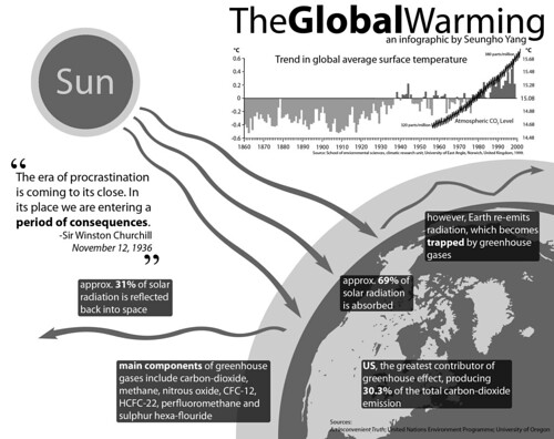
TheGlobalWarming Infographic


TheGlobalWarming Infographic, originally uploaded by Seungho.

Found on Flickr by Seungho.

Saturday, September 22, 2007

Earth At Night


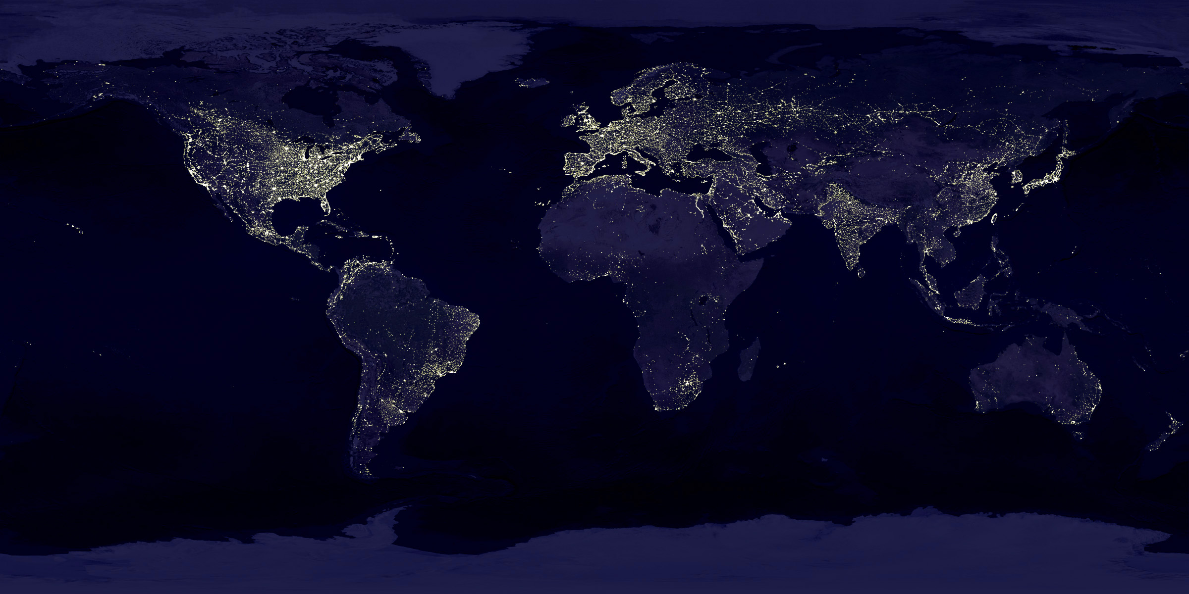
This satellite photo from NASA spans a 24-hour period showing the entire surface of the Earth in darkness. The lights obviously show the highest areas of concentration of civilization.
Note the Nile River delta, the Siberian Express railway route, the Australian coastal cities, and Africa, literally "the dark continent".
From Princeton's International Networks Archive, the old project of Jonathan Harris.

Sunday, September 16, 2007

The Elegant Universe


Following my earlier post on Imagining the Tenth Dimension, I found that NOVA has put the entire 3-hour show The Elegant Universe on their website.


The show is full of different visual methods to visual strings, gravity, the scale of particles and multiple dimensions. Brian Greene really did a fantastic job with this show based on his book on the same name.

Monday, September 10, 2007

Analytics according to Captain Kirk


This is fun one from Matt Bailey, founder of SiteLogic.com.

You can read his full description here, but the point is the use of images in the chart so you can visualize the relationship between separate pieces of information. Phasers represent fights in each episode, Kirk's photo represents affairs during the episode with Captain Kirk and the colored shirts show fatalities of an actor in that colored shirt in that particular episode. Proving once and for all that being a red-shirted ensign is a hazardous job on the Enterprise.

Friday, September 7, 2007

The Cosmic Calendar


This last December was the 10th anniversary of Carl Sagan's death. One of his most popular episodes of Cosmos was titled The Dragons of Eden where he first described his Cosmic Calendar. This website from discovery.com has a simple image showing the Cosmic Calendar as Carl described it. A few websites are selling posters of the Cosmic Calendar, like AllPosters.com.

The premise is that if you compress the entire history of the universe into a calendar year, homo sapiens only exist in the last 6 minutes, and the last second represents the last 400+ years of human history.

You can see Cosmos, and hear Carl describe it on YouTube here:

Sunday, August 26, 2007

Bodies in the Solar System


Another great infographic on kokogiak.com showing the relative size of large objects (88 of them, at least over 200 miles in diameter) in our solar system. The largest (of course) being the sun down to the smallest, which is Davida, an asteroid 203 miles in diameter.

Sunday, August 12, 2007

Starship Dimensions


As a follow-up to my earlier post on the Starship Comparison Poster, the Starship Dimensions website has a much more extensive library of sci-fi ships all shown to scale. There are so many here that the website is broken up into different pages from small scale up to "Big" scale. Click on the tabs across the top to pick a scale (100X, 10X, 1X, etc.).

Fantastic resource. Jeff Russell has done a great job accumulating the images and tracking down their relative sizes.