Showing posts with label Digg. Show all posts

Wednesday, July 23, 2008

Map of Online Communities


Greetings from the Blogipeligo!


A fun infographic from xkcd.com that uses a map image to communicate the relative sizes of the different types of online communities.  I was impressed that I at least recognized most of them, and actually participate in some of them.

Friday, July 18, 2008

Who Owns the West?


Found on digg.com, this map was posted on strangemaps.com.  The portion of each state shows the amount of land in each state owned by the Federal Government, but not the specific location.  It's centered in each state just to show the relative size.


This map appeared as an illustration to ‘Can the West Lead Us To A Better Place?‘, an article in Stanford Magazine, a periodical for and about alumni from that university.

Monday, April 21, 2008

The Fall of Tech on digg.com


From readwriteweb.com, an area chart showing the decline of Tech stories made popular on digg.com. Although initially the front page of digg.com was totally dominated by Tech stories and the primary users were tech geeks, the World & Business category is now the reigning king with the most stories made popular.
To put this into context, on 1 January 2006 tech stories made up 78% of the total popular stories (i.e. stories that made it onto the digg frontpage). By end of March 2008, that percentage had dropped to 18-20%.


Here you can see the same information charted as total number of stories made popular instead of percentages.

Wednesday, April 16, 2008

Quake Family Tree

From Wikipedia, the Quake Family Tree shows the history of the Quake computer game engine and all of the other games that were built from each version using a mind map.

Found on digg.com

Wednesday, April 2, 2008

Who Owns the Organic Food Companies?


Great chart by Phil Howard from Good Magazine showing which of the large food processing companies own some of the most popular organic food brands. Pepsi owns Naked Juice?

Found on digg.com after I heard about it on the diggnation podcast.

Thursday, March 13, 2008

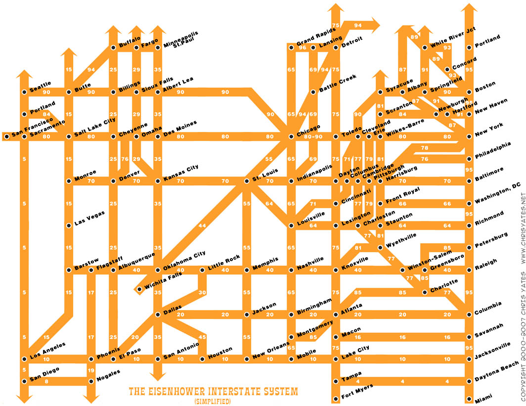
The Eisenhower Interstate System


What a fantastic way to simplify the U.S. interstate system into an easy to understand graphic. From Chris Yates on chrisyates.net. Style looks like a subway map.

Found on Digg.

Thursday, January 10, 2008

Digg These Pics


Really cool new feature over on Digg.com. Back in late 2007, they added an Images category so users could digg their favorite pictures. Now they've added an interactive image viewer in the Digg Labs that lets you see new images and pictures being dugg in real-time.

The only thing I don't like is that it doesn't let you add any search terms. You have to see all of the activity, and can't narrow it down it all.

Monday, January 7, 2008

The Software Wars


Found originally on Digg Images, this one is hosted on Steven Hilton's website (the author).


I guess you could call this a Mind Map style, but it's more like a Battlefield style infographic. I really like how it shows the products that multiple competitors are challenging Microsoft with and the associated product on the Microsoft side that is being challenged.

Wednesday, December 12, 2007

NodeTrix: A Hybrid Visualization of Social Networks


NodeTrix was a study of social networks by Nathalie Henry, Jean-Daniel Fekete, and Michael J. McGuffin from France and Canada. Natalie presented their results at the InfoVis conference in Sacramento, CA in November.

Saturday, November 17, 2007

Who has the Oil?


I caught this on Digg, it's a map from civicactions.com. There's some good debate in the comments on Digg about the accuracy of the map.

The size of the country represents the relative amount of oil reserves in each country, and teh color of the country represents how much oil is consumed by that country.

Tuesday, August 28, 2007

A Day of Diggs


This one is really interesting. Stamen Design took one day of digg.com and visualized the user activity. The explanation is really cool, and can be found here on content.stamen.com. Stamen works with Digg on a number of the tools available in Digg Labs.

Red dots represent people that have been on Digg for a while, yellow is a good mix, and blue is new users. So when a story is predominantly blue, it represents a story that is attracting a bunch of new users to Digg.

Wednesday, July 18, 2007

Digg Swarm


If you don't read Digg...shame on you.

For the rest of us, Digg has become an incredibly valuable source of information. But paging through pages of text for something to catch your eye gets old quick.

Digg Swarm was launched in 2006, and I have increasingly used it more and more since then. It has really grown on me. You can watch in real-time stories that get "Dugg" to become more popular. The visual size of the story bubble grows as the story's popularity grows. The yellow dots connected to the story show you who is digging the story, and the size of the yellow dot shows you how important that user is in the Digg universe.

Also, if the same person Diggs two stories, a connecting line is shown to highlight other story bubbles that may interest you. The connecting line between two stories gets thicker as more users Digg the same two stories showing a stronger connection.

Usually I start it up and let it run for a little while before I check it out. That way it has some time to build up some connections and story history. It starts from scratch when you start, so you only see the stories that are Dugg from that point in time and after.