Showing posts with label mind map. Show all posts

Saturday, December 12, 2009

My Digital Life - personal infographic


My Digital Life, is an quick infographic by me!  A mindmap or network map of the digital products in my life, and how they all interconnect. Each connection is color-coded by the connection type (USB, wireless, ethernet, etc.) including its respective standard icon.  High-res version is on Flickr.

This started as a simple sketch to help me determine how to add a new external hard drive I got on Black Friday, but it quickly became much more fun to see how far out I could push the network.  I already know of some more that I want to add, so someday there may be a 2.0 version.  Apparently, I could use an IT manager at home.


I did ignore some differences within the connection types to keep this fairly simple.  I don't distinguish between USB 1.1 and USB 2.0 connections.  I use "Display" as a connection type, but its a DVI connection for the MacBook, a HDMI connection from the AppleTV and a composite connection from the DVD player.  I also show only one "Wireless" connection, but I know that the iPhone only uses 802.11g and the laptop uses 802.11n.

I did this using OmniGraffle, with a little help from Pixelmator and Keynote to clean up the images.

Tuesday, November 17, 2009

Webpages As Graphs - Cool HTML visualizer applet


Marcel Salathe has created Webpages As Graphs, an interactive HTML DOM visualizer applet that will view any http:// website in a graphic form.  The image above is Cool Infographics, but the arrangement comes out a little different every time you run it.

Using Processing, Traer Physics and HTMLParser the site lets you enter the domain and then watch while it works its magic.  He has also made the source code available and instructions to print your graph as a poster.
HTML consists of so-called tags, like the A tag for links, IMG tag for images and so on. Since tags are nested in other tags, they are arranged in a hierarchical manner, and that hierarchy can be represented as a graph. I've written a little app that visualizes such a graph
I ran it for a number of other websites to see the differences, some were inspired by the examples on Marcel's site.

Amazon.com: Pretty complex site with lots of links, images and tables.


Apple.com: Simple design, as you expect from Apple.


Google.com:  Known for their clean front page.


LifeHacker.com:  Great blog with a very complex structure.


Friday, October 23, 2009

Collaborative, Online Mind Map about Mind Mapping Software


I know, that's a mouthful of a title.  MindMeister is an online, collaborative mind mapping tool that lets multiple users edit a common mind map.  Essentially, its a visual wiki, that allows anyone to makes changes to the data, but you need to be logged in so that it can track who makes the changes.

Andrew Wilcox has created a public mind map with the catchy title "The Strengths and Weaknesses of Mind Mapping Software Applications".  You can see all of the different mind mapping software packages, the pros and cons of each one, and add your own comments.


Your voice can still be heard, a few of the software applications don't have any comments at all yet.  They need people to help add information to the map.

Found on the Mind Mapping Software Blog, by Chuck Frey

Also, MindMeister has an iPhone app that allows you to view and edit online mind maps from your iphone.  It's $6.99US in the iTunes App Store.  MindMeister (mind mapping)

Tuesday, August 4, 2009

NEW Death and Taxes 2010 poster!!


First, Jess from WallStats.com has released the 2010 Death & Taxes poster.  This is one of the best infographic examples today.  It's extremely informative, and the topic has a very wide reach.  The Death & Taxes poster from 2007 was my initial post on Cool Infographics, so I'm very excited to see this update.   Now the 2010 version is available to purchase as a poster here. Great job Jess!

Second, I'm really impressed by the viewer code for the poster. It's from Zoomorama.com, and lets me embed the interactive viewer.  The built-in zoom is pretty nice, but the Quick Find index on the left side is the best part.


Monday, June 22, 2009

Market Visual (BETA) knowledge maps


I came across Market Visual Knowledge Maps this morning.  It claims to still be in BETA, and it maps business relationships based on companies or people that you enter.  It seems to build these mind maps on the fly, and saves any maps that you have build so you can retrieve them later.


It's a service you have to pay for, but if you're looking through annual reports and SEC filings to find people and connections, this will save you a bunch of time.  There's a fully interactive sample map, as well as an introductory video.

Tuesday, June 16, 2009

The Conversation Prism 2.0 has been released!


Check out the new version of The Conversation Prism 2.0 by JESS3 and Brian Solis and theconversationprism.com.  Available as a poster for $20 US on thier website, and they also have some high-resolution versions available.

I love the design of this one.  It's seems to be essentially a mind map, but much easier to read and understand.

This is an update to the original Conversation Prism that you can see here on Flickr.

Thanks Dana!  I found the link to the 1.0 version on ON:Digital+Marketing

Thursday, March 5, 2009

Chart Chooser


A quick reference guide (in the form of a mind map) by Andrew Abela on choosing the right type of chart for the type of message you are trying to communicate with your data.

Found on Digital Inspiration

Monday, October 20, 2008

NEW Death and Taxes 2009 poster


New Death and Taxes infographic for 2009!  Interactive viewer let's you zoom in to see all of the details.
"Death and Taxes:2009" is a representational poster of the federal discretionary budget; the amount of money that is spent at the discretion of your elected representatives in Congress. Basically, your federal income taxes. The data is from the President's budget request for 2009. It will be debated, amended, and approved by Congress by October 1st to begin the fiscal year.

The poster provides a uniquely revealing look at our national priorities, that fluctuate yearly, according to the wishes of the President, the power of Congress, and the will of the people. If you pay taxes, then you have paid for a small part of everything in the poster. 
The Death and Taxes poster from 2007 was my initial post on Cool Infographics, so I'm very excited to see this update.  Now the 2009 version is available to purchase as a poster here.

Thursday, July 3, 2008

Top 10 UK Brands 2007 Visualisation


Top 10 UK Brands 2007 Visualisation, originally uploaded by visual think map.
Inspired by the infographic "Who Owns the Car Companies" that I originally posted about in October 2007, Chris Watson, from Visualthinkmap.blogspot.com, has created a cool infographic showing the owners for some of the top brands in the UK.

Great job Chris!

Tuesday, May 13, 2008

Microsoft HealthVault Xplaned


Microsoft enlisted our friends from Xplane to help visualize the theory behind the HealthVault system.

I would almost call this a 3D mind map the way it's laid out.

Sunday, April 27, 2008

Who Owns the Car Companies? (UPDATE)


TooManyCars.com has updated their family tree style poster of how all of the car companies are related. The latest updates were as of 4/1/08. They have also changed to better software used to zoom into the poster. Each of rectangles you see on the images will zoom in close so you can read the details about the connections.

They've really done a good job tracking down the specific types of relationships and the ownership portions between the companies. High-res PNG or PDF files are also available.

Wednesday, April 16, 2008

Quake Family Tree

From Wikipedia, the Quake Family Tree shows the history of the Quake computer game engine and all of the other games that were built from each version using a mind map.

Found on digg.com

Tuesday, April 8, 2008

On The Map


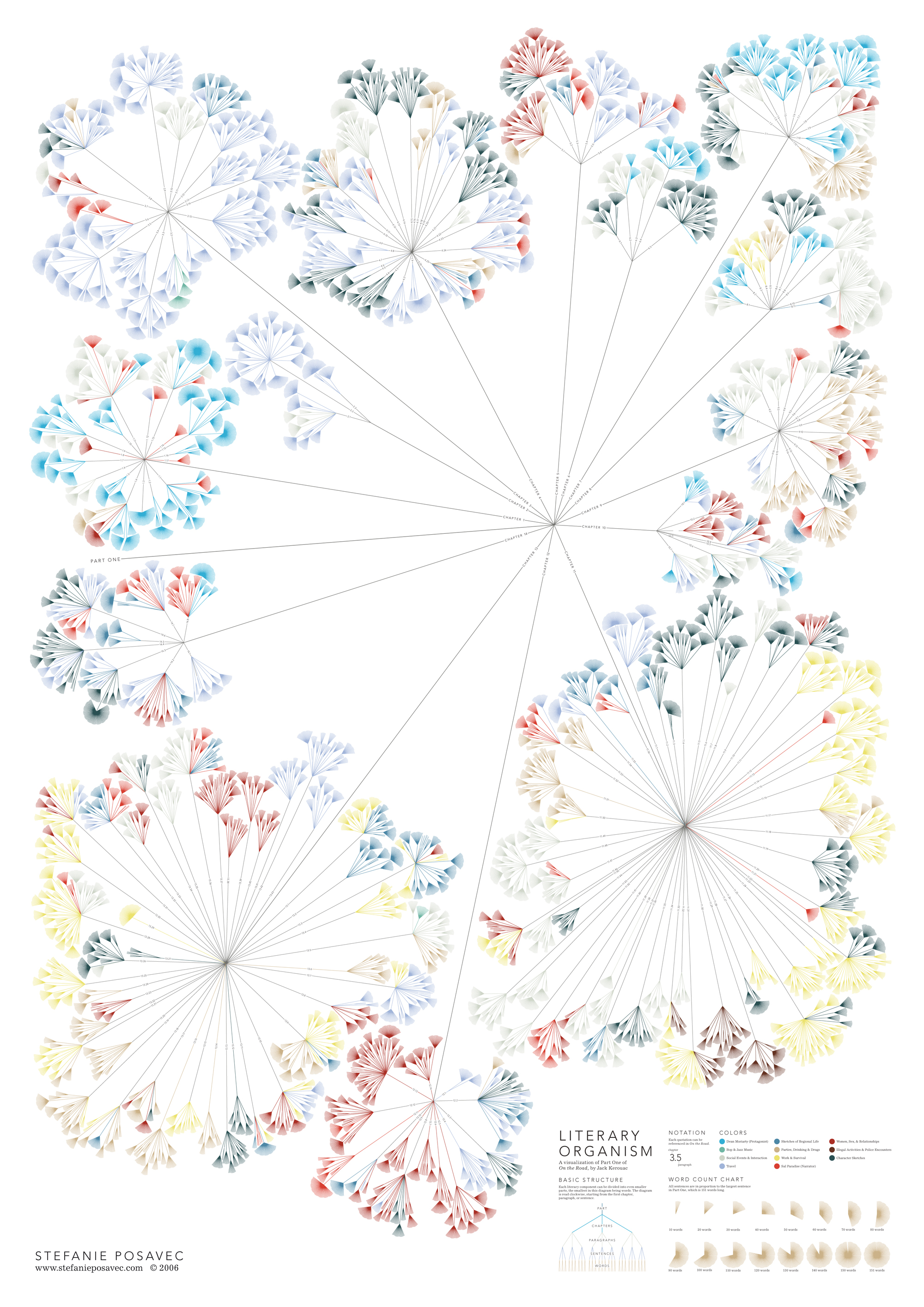
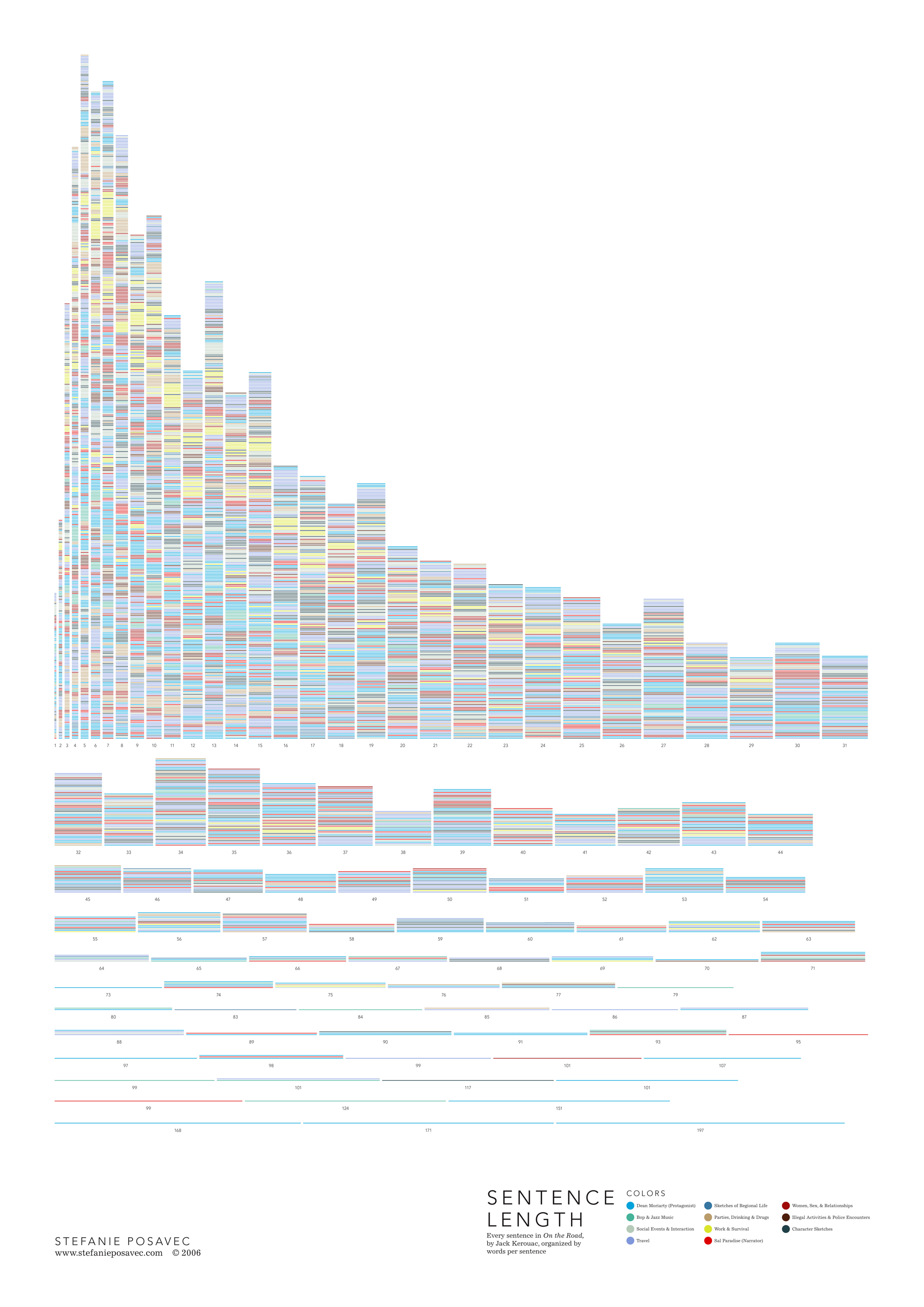
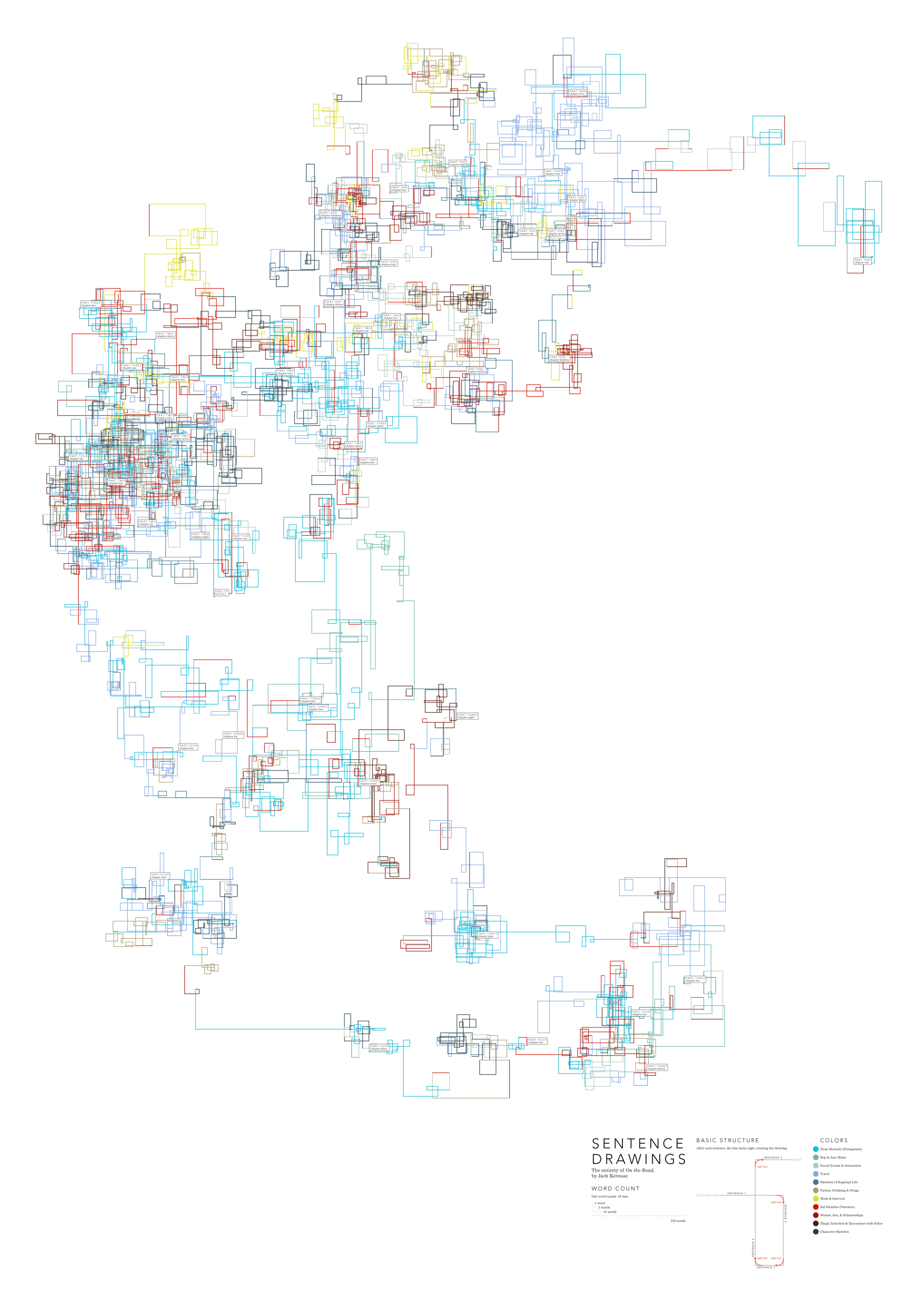
Found on notcot.com, On The Map is a cool project by Stefanie Posavec that maps the rhythm and flow of literary works into some stunning visual posters. Breaking a story down into chapters, paragraphs, sentences and finally individual words. Then color coded to capture the topics as they reappear throughout the story. The level of detail is really impressive. Click the images to see the high-resolution images from notcot.com.

Thanks Jonathon and Jason for sending the link.

Stefanie also created a number of additional visualizations of the same story.


Monday, January 7, 2008

The Software Wars


Found originally on Digg Images, this one is hosted on Steven Hilton's website (the author).


I guess you could call this a Mind Map style, but it's more like a Battlefield style infographic. I really like how it shows the products that multiple competitors are challenging Microsoft with and the associated product on the Microsoft side that is being challenged.

Monday, November 5, 2007

Visuwords


Visuwords is a new website that visually shows the relationships between words. More than an online dictionary or thesaurus. The relationships are shown graphically like a mind-map.
Visuwords™ online graphical dictionary — Look up words to find their meanings and associations with other words and concepts. Produce diagrams reminiscent of a neural net. Learn how words associate.
Found on LifeHacker.

Tuesday, October 23, 2007

Who Owns the Car Companies?

I found three different images showing the complex network of ownership between the automotive companies. Three different attempts at making these complex relationships easier to understand. This first one is a scan from a magazine, but I can't find any reference to which actual magazine it came from. Charted out like a subway map, it's pretty easy to follow.

This next one from Too Many Cars is charted like a family tree, or a mind map. It's the easiest the follow, but probably the least aesthetically pleasing. Online the image is broken into smaller pictures so you can zoom closer, but is also available as a large poster in PNG or PDF formats. The data for this one is from 2006, and is the most current of the three.


This last graphic claims to show the ownership mix in the auto industry as a form of bubble chart, but I can't find any date or source data link. I think the bubble sizes represent something, like size of the company or ownership, but I can't tell. So I can't tell how accurate this is. The image is on Tinypic.

Wednesday, September 19, 2007

The inner mind of a brand geek


A subject near and dear to my heart, I found this poster on Visual Complexity. This map "illustrates the intricate, interwoven relationship between businesses and their brands." The source appears to be 300million.com, which is a Marketing agency in the UK.

I love this map, and I thought this would be a good entry to the VizThink Mind Map Contest.

Sunday, July 15, 2007

Wiki Mind Map

wikimindmap.org

This is an awesome way to browse around on Wikipedia! Start with one key phrase, and this site will automatically generate a mind map based on the links in Wikipedia. You can explore and follow the links by shifting any of the outer links to the center of a new map, or click on the link text to go to the Wikipedia page.