Showing posts with label health. Show all posts

Wednesday, December 9, 2009

The Origins and Paths of Epidemics


This world map shows the origins and spreading paths of Malaria, Leprosy and Small Pox. No legend, but the implication is that as the main arteries diminish in width down to small capillaries represents the number of infection cases.  Key dates and locations are also identified with event description.

There is no designer byline on the graphic, but map is credited to Haisam Hussein.  I don't see the map in the gallery on Haisam's website, but he is given credit for the map on Lapham's Quarterly.

Found on digg.com.

Wednesday, November 25, 2009

Florence Nightingale: Causes of Mortality infographic from 1858!


Yes, from that Florence Nightingale (1820-1910), and it's from 1858!  The polar area diagram is also known as the Nightingale Rose Graph.

From Wikipedia,
This "Diagram of the causes of mortality in the army in the East" was published in Notes on Matters Affecting the Health, Efficiency, and Hospital Administration of the British Army and sent to Queen Victoria in 1858.


This graphic indicates the number of deaths that occured from preventable diseases (in blue), those that were the results of wounds (in red), and those due to other causes (in black). 
The legend reads: 
The Areas of the blue, red, & black wedges are each measured from the centre as the common vertex. The blue wedges measured from the centre of the circle represent area for area the deaths from Preventable or Mitigable Zymotic diseases, the red wedges measured from the centre the deaths from wounds, & the black wedges measured from the centre the deaths from all other causes. The black line across the red triangle in Nov. 1854 marks the boundary of the deaths from all other causes during the month. In October 1854, & April 1855, the black area coincides with the red, in January & February 1855,(*) the blue coincides with the black. The entire areas may be compared by following the blue, the red, & the black lines enclosing them.
Also from Wikipedia:
Florence Nightingale had exhibited a gift for mathematics from an early age and excelled in the subject under the tutorship of her father. Later, Nightingale became a pioneer in the visual presentation of information and statistical graphics. Among other things she used the pie chart, which had first been developed by William Playfair in 1801.
Florence Nightingale is credited with developing a form of the pie chart now known as the polar area diagram, or occasionally the Nightingale rose diagram, equivalent to a modern circular histogram to illustrate seasonal sources of patient mortality in the military field hospital she managed. Nightingale called a compilation of such diagrams a "coxcomb", but later that term has frequently been used for the individual diagrams. She made extensive use of coxcombs to present reports on the nature and magnitude of the conditions of medical care in the Crimean War to Members of Parliament and civil servants who would have been unlikely to read or understand traditional statistical reports.
In her later life Nightingale made a comprehensive statistical study of sanitation in Indian rural life and was the leading figure in the introduction of improved medical care and public health service in India.
In 1859 Nightingale was elected the first female member of the Royal Statistical Society and she later became an honorary member of the American Statistical Association.
Found this while reading the great FlowingData post "9 Ways to Visualize Proportions – A Guide" by Nathan Yau.

KXVTA2R4XWE3
FRJK52DWMBJQ

Thursday, September 10, 2009

HealthMap: The Global Disease Alert Map


HealthMap.org is an online map tool that locates any reports of disease from a selection of news sources.  Available in multiple languages, HealthMap is a great use of the Google Maps API.  In fact, HealthMap is funded by Google, which explains why they are so dependent on the Google Maps data.
HealthMap brings together disparate data sources to achieve a unified and comprehensive view of the current global state of infectious diseases and their effect on human and animal health. This freely available Web site integrates outbreak data of varying reliability, ranging from news sources (such as Google News) to curated personal accounts (such as ProMED) to validated official alerts (such as World Health Organization). Through an automated text processing system, the data is aggregated by disease and displayed by location for user-friendly access to the original alert. HealthMap provides a jumping-off point for real-time information on emerging infectious diseases and has particular interest for public health officials and international travelers.
They also recently launched an iPhone app called Outbreaks Near Me, available for free in the iTunes app store.  The app allows you to view the maps from your iPhone and get alerts for outbreaks in your area.

Wednesday, September 9, 2009

Balance Your Media Diet (The Media Pyramid Infographic)


From Wired Magazine's "New Rules for Highly Evolved Humans" section of the August 2009 issue.
Practicing good nutrition keeps your mind sharp, your body fit, and your life long. The same could be said for consuming media. (Seriously, knowledge is power.) When you add it all up, the average American spends roughly nine hours a day glued to some kind of screen, and like your diet, quality is as important as quantity. Here areWired's suggested servings for optimal media health.
Found on Nathan's Flowingdata.com

Friday, September 4, 2009

New Hans Rosling video, using GapMinder (Must see!)


New TED Talk video of Hans Rosling talking to the U.S. State Department, "Let my dataset change your mindset".  Using the GapMinder software that was purchased by Google, Hans shows the third world isn't as far behind the U.S. as most people believe.

Tuesday, August 18, 2009

American health care on (4) napkins


Dan Roam, author of Back of the Napkin, has posted a napkin explanation of the American Health Care debate on his blog.  It took him 4 napkins to complete his explanation, but I think he did a really good job trying to help people understand a very complex issue.

He has also published a slideshow of the complete series up on SlideShare.net


Check out Dan's great book, Back of the Napkin.


Thursday, June 11, 2009

Sugar Stacks: How Much Sugar is in your Food?


SugarStacks.com is a website dedicated to showing you how much sugar is in the food we eat.  Using a simple visual of stacked sugar cubes, you can see the sugar content of many different types of food.  I love that it's simple and visually gets one point across really well.  There are words on website, but you really don't need them.

We've used regular sugar cubes (4 grams of sugar each) to show how the sugars in your favorite foods literally stack up, gram for gram.  Compare foods, find out where sugar is hiding, and see how much of the sweet stuff you're really eating.

Found on Infosthetics.com, and as they note, the website doesn't differentiate between types of sugars, the white sugar cubes are used to represent them all.

Thursday, October 30, 2008

The Future of Food


Wired magazine has a great series of nine infographics from the November issue about the world's food supply problems.
Forty years ago, advances in fertilizers and pesticides boosted crop yield and fed a growing planet. Today, demand for food fueled by rises in worldwide consumption of meat and protein is again outpacing farmers ability to keep up. It's time for the next Green Revolution.
Thanks for the link Ethel!  Here are a few more.  Check them all out on Wired.com.


Monday, August 11, 2008

Awesome Medical Visualizations


Really neat promotional video for Hybrid Medical Animation.  These guys do some amazing work.

Friday, August 1, 2008

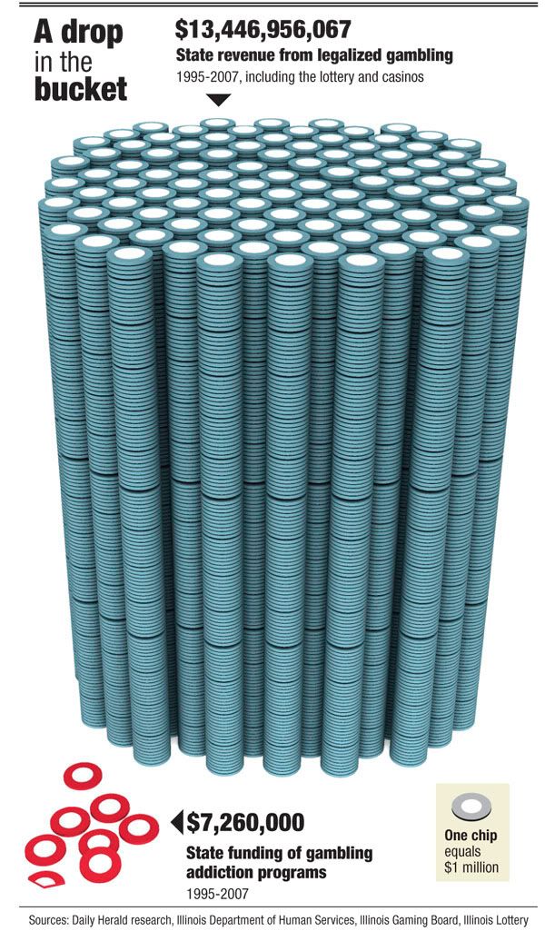
Small Gambling Addiction Spending Visual


I love this very simple but powerful visual comparison of the gambling revenues and the money spent on gambling addiction support programs.  The author is only trying to communcate one point, and gets his message across very stongly.  I believe it was done by Tim Broderick, from the Daily Herald.


Found on InfographicsNews.blogspot.com.  Looks like

Thursday, July 31, 2008

Anatomy of a Balloon Animal


Now here's an odd poster by Jason Freeny depicting the internal anatomy of balloon animals.  Check it out along with his other works at Moist Productions.  I especially liked that he included visual instructions on how to create the balloon animal at the bottom.


Thank Torquil for sending in the link!

Thursday, June 19, 2008

Grocery Aisle Nutritional Values


Three different ways to view the grocery store from Wired Magazine Infoporn January 2008 (16.01) by Dan Marsiglio. Cost per Calorie, Calories by Weight and Sugar by Weight.

If you're trying to cut back on the sugar in your diet, stay away from the cereal aisle!

Tuesday, June 3, 2008

The Infographic that Saved a Million Lives


Great story from 37signals.com about a very simple infographic that motivated Bill and Melinda Gates to change the focus of their charity spending.
“No graphic in human history has saved so many lives in Africa and Asia,” says NY Times columnist Nicholas Kristof about an infographic in a ‘97 Times article that spurred Bill and Melinda Gates to take action on public health.

...But then bill confessed that actually it wasn’t the article itself that had grabbed him so much—it was the graphic. It was just a two column, inside graphic, very simple, listing third world health problems and how many people they kill. but he remembered it after all those years and said that it was the single thing that got him redirected toward public health.

Tuesday, May 13, 2008

Microsoft HealthVault Xplaned


Microsoft enlisted our friends from Xplane to help visualize the theory behind the HealthVault system.

I would almost call this a 3D mind map the way it's laid out.

Monday, April 21, 2008

The Fall of Tech on digg.com


From readwriteweb.com, an area chart showing the decline of Tech stories made popular on digg.com. Although initially the front page of digg.com was totally dominated by Tech stories and the primary users were tech geeks, the World & Business category is now the reigning king with the most stories made popular.
To put this into context, on 1 January 2006 tech stories made up 78% of the total popular stories (i.e. stories that made it onto the digg frontpage). By end of March 2008, that percentage had dropped to 18-20%.


Here you can see the same information charted as total number of stories made popular instead of percentages.

Saturday, April 19, 2008

Map of World Happiness


From geostrategis.com, the world's first map of world happiness.
This world map on happiness was distributed through a Globe and Mail article by Sheryl Ubelacker (28/07/06). It is an interesting perspective, but primarily focused on the social side of well being. It provides a strong visualization but lacks the substance to become a strategic or policy significant map. This map was prepared by Adrian White, University of Leicester

Wednesday, April 2, 2008

Who Owns the Organic Food Companies?


Great chart by Phil Howard from Good Magazine showing which of the large food processing companies own some of the most popular organic food brands. Pepsi owns Naked Juice?

Found on digg.com after I heard about it on the diggnation podcast.

Saturday, March 8, 2008

See the World in Words


I thought this was really cool!

Sunday, March 2, 2008

What if...


Craig Robinson, from flipflopflyin.com, has created a graphic showing many of the different paths/branches his life could have taken. Clicking on each character icon reveals text describing the event or deviation from actual events.
Who hasn't at one time or another wondered how their life could've gone in other directions if different events had occurred or different choices been made? These are the ways my life could've deviated from its actual path (the top row).
" Craig dies at the age of 34, killed by an angry swan" I found incredibly funny.

Found on NiXLOG.

Saturday, March 1, 2008

Lance's Last Tour


I found two good newspaper infographics from 2005 covering Lance Armstrong's last Tour de France on newsdesigner.com where you can get larger PDF files that make good posters. Both are two-page graphics (doubletrucks). The first is from The Oregonian (above), and the second is from the St. Pete Times (below).


Found on NiXLOG.