Showing posts with label size. Show all posts

Saturday, July 11, 2009

How Much is a Petabyte?


From Mozy.com, a pretty large infographic (as you might expect from the name).
We store a lot of data here at Mozy (15+ petabytes, in fact), but how much is that really? We put together this series of stats to help you understand just how much data that really is. Enjoy!
Thanks Matthew!

Monday, March 2, 2009

Taking the Train

It's not a complicated one, but I like Good Magazine's summary of the biggest train systems in the world (top 5 U.S. cities and top 5 foreign cities).  The silhouettes represent the daily rides in the city, and the length of the train shows how many miles that system covers.  To the right is a quick map of each city's subway system and some statistics about their subway system.

Thanks Li, for sending in the link!

Wednesday, December 24, 2008

The Tallest Building: Burj Dubai


The Burj Dubai is a construction project to build the world's tallest building in Dubai.  Their website has a nice interactive comparison to the other key skyscrapers in the world.  The photo-like images on a black background with the reflection is very similar to the Apple Computer photo slideshows.
The goal of Burj Dubai is not simply to be the world's highest building.  It's to embody the world's highest aspirations.  Burj Dubai looks different depending on where you're standing.  For those living nearby, it is a shining accomplishment - tangible proof of Dubai's central role in a growing world.
Thanks Alwyn!

Wednesday, October 29, 2008

Classic infographic from 1823!


Here's a classic from 1823!  It a hand drawn infographic titled "Comparative Heights of the Principal Mountains and Lengths of the Principal Rivers of The World" by WR Gardner.  The high resolution image is on Flickr, but the post about the image is on bibliodyssey.blogspot.com.

This one makes a great poster!  Thanks Roi for sharing in the comments.

Monday, October 20, 2008

NEW Death and Taxes 2009 poster


New Death and Taxes infographic for 2009!  Interactive viewer let's you zoom in to see all of the details.
"Death and Taxes:2009" is a representational poster of the federal discretionary budget; the amount of money that is spent at the discretion of your elected representatives in Congress. Basically, your federal income taxes. The data is from the President's budget request for 2009. It will be debated, amended, and approved by Congress by October 1st to begin the fiscal year.

The poster provides a uniquely revealing look at our national priorities, that fluctuate yearly, according to the wishes of the President, the power of Congress, and the will of the people. If you pay taxes, then you have paid for a small part of everything in the poster. 
The Death and Taxes poster from 2007 was my initial post on Cool Infographics, so I'm very excited to see this update.  Now the 2009 version is available to purchase as a poster here.

Friday, July 18, 2008

Who Owns the West?


Found on digg.com, this map was posted on strangemaps.com.  The portion of each state shows the amount of land in each state owned by the Federal Government, but not the specific location.  It's centered in each state just to show the relative size.


This map appeared as an illustration to ‘Can the West Lead Us To A Better Place?‘, an article in Stanford Magazine, a periodical for and about alumni from that university.

Friday, May 16, 2008

Global Distribution of Water


From the United Nations Environment Programme website, the Global Distribution of Water specifically highlights the scarcity of freshwater.

Found on digg.com

Monday, April 14, 2008

Treemaps for drive space

I don't think I've posted much about specific software programs, but there are a number of infographic programs that anyone can use. These two are programs that analyze what's on your hard drive, and show it you in a treemap display.

The one above is Disk Inventory X for the Mac (which I use), and the one below is WinDirStat for Windows. Both are free, and are real-life examples of how you can use infographics in your life. So take a minute, and clean off some of that old junk taking up space on your hard drive.

Tuesday, April 1, 2008

Visualizing Pi (π)


Cool little GIF animation to visualize the value of Pi (π) from Wikipedia. Click the image to view the animation.

Found on digg.com

Monday, March 3, 2008

The Calculators of HP poster


From the The Hewlett Packard Calculator Page.
This poster shows every HP calculator made starting with the famous HP-35. Each calculator is displayed with it's production start and end data, and it's project codename.
It's amazing how many of these I have actually used. This is similar to the Evolution of Apple Design...but with more buttons.

Friday, February 8, 2008

How many employees does Google have?

16,805 full-time employees worldwide as of December 31, 2007, Google says. Here on blogscoped.com visualized with one icon per person. It's a big image.

Found on Infosthetics.

Thursday, January 17, 2008

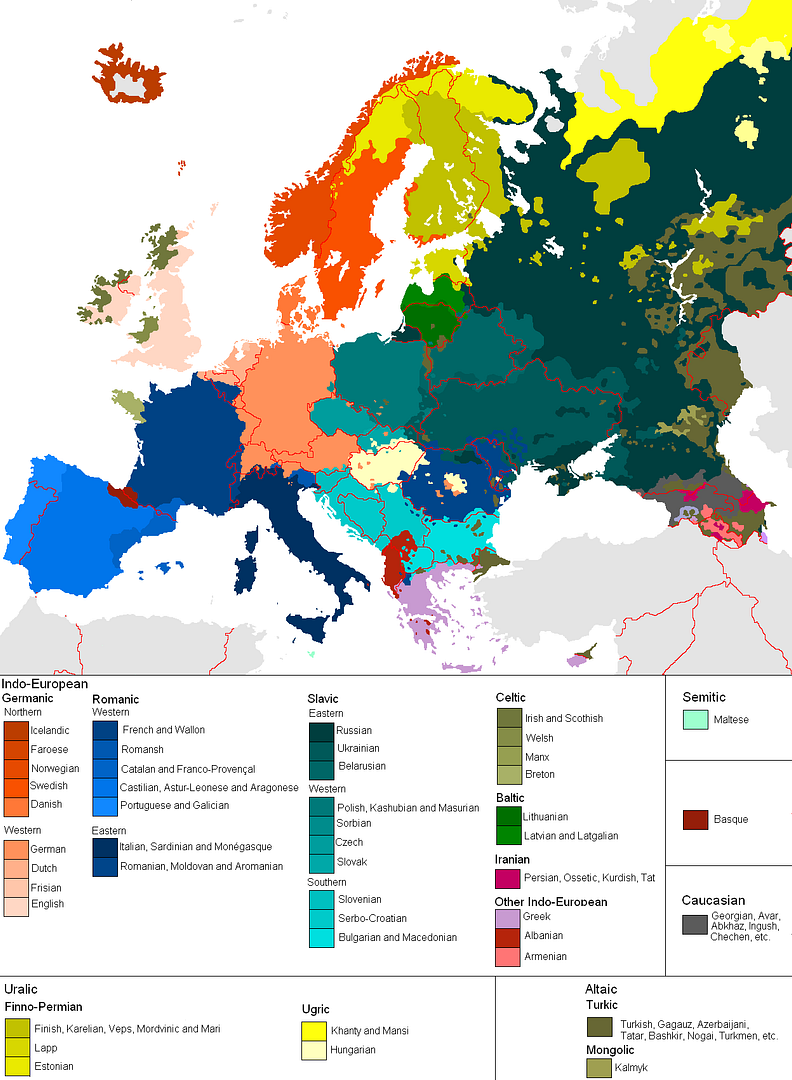
Map of European Languages


This is a great map, found on Photobucket.com uploaded by the user pizzler. In the U.S. we understand that other countries sometimes speak foreign languages, but we have the advantage that all 50 states speak the same language (or at least a similar version of the same language). So it's somewhat of an abstract concept to most Americans. And European geography isn't exactly a major topic in the U.S. school system, so most people don't understand how many countries there are, and especially how small some of them are.

This visual map really helps convey the diversity within the EU. It maps 46 languages across the European continent, and I know there are more. I can't imagine how difficult it must be for the EU to actually get anything done between countries.

Tuesday, January 1, 2008

Smoking Kills 200,000 Every 6 Months


Skull With Cigarette, 2007 [based on a painting by Van Gogh]
72x98"

Depicts 200,000 packs of cigarettes, equal to the number of Americans who die from cigarette smoking every six months.

I've become a big fan of Chris Jordan's work, especially the Running The Numbers series. I just noticed that he has added to the collection on his website with some new pieces! A friend of mine quit smoking this week, so in her honor I want to share one of the new artwork pieces.

Sunday, December 23, 2007

Miraculous Logistics Behind Operation Christmas


Holiday Infoporn from Wired.com.
Here's our theory: There is, in fact, a nonsupernatural Santa. It's a transnational corporation with one mission-critical fulfillment goal: Every kid who celebrates the holiday gets a toy on Christmas eve.
Check out the side-scrolling timeline at the bottom. I think they should have included Chinese New Year.

Saturday, December 22, 2007

The Disney Cruise Line Cut-Away


The family took our first Disney Cruise this year, which was fantastic! Here's a great cut-away graphic of the Disney Wonder, but the other ship, the Disney Magic is almost identical. This graphic is a little out of date, because some things have changed. The ESPN Skybox is now a teen area called The Stack or Aloft depending on which ship you're on.

The ship is actually quite large, so the spacial representation of locations is really helpful. You can get turned around very easily.

Sunday, September 16, 2007

The Elegant Universe


Following my earlier post on Imagining the Tenth Dimension, I found that NOVA has put the entire 3-hour show The Elegant Universe on their website.


The show is full of different visual methods to visual strings, gravity, the scale of particles and multiple dimensions. Brian Greene really did a fantastic job with this show based on his book on the same name.

Sunday, August 26, 2007

Bodies in the Solar System


Another great infographic on kokogiak.com showing the relative size of large objects (88 of them, at least over 200 miles in diameter) in our solar system. The largest (of course) being the sun down to the smallest, which is Davida, an asteroid 203 miles in diameter.

Drawing Disney Characters


Silver Bullet Comics has an article for aspiring comic artists, but I found this little gem.

A very simple infographic demonstrating that characters much each have a distinctive shape that makes them recognizable even from a distance. Very similar to the "silhouette test" for good character drawings to be recognizable in silhouette.

Sunday, August 12, 2007

Starship Dimensions


As a follow-up to my earlier post on the Starship Comparison Poster, the Starship Dimensions website has a much more extensive library of sci-fi ships all shown to scale. There are so many here that the website is broken up into different pages from small scale up to "Big" scale. Click on the tabs across the top to pick a scale (100X, 10X, 1X, etc.).

Fantastic resource. Jeff Russell has done a great job accumulating the images and tracking down their relative sizes.

Thursday, July 19, 2007

The Size of Our World


This is a simple, but great infographic. How big are the planets? How big is our Sun? How small is the Earth? The site shows five different images on increasingly larger scales.

No numbers or measurements. Easy to understand. So simple, yet SO informative.

The Size of Our World