Who participates online?

A good one from BusinessWeek.com. This chart shows the participation in the various Web 2.0 activities by age group.
As part of Gen X, these graphs look like a tidal wave rising up behind me.







 This map of Iraq from the NYTimes.com visually shows the over 1,900 people killed in Iraq during the month of January 2007.
 "The map, based on data from the American, British and Iraqi governments and from news reports, shows the dates, locations and circumstances of deaths."The number has doubled since they did this for January 2006 which had around 800 deaths. Each figure represents an individual of the American forces, coalition forces, Iraqi forces, police officers or civilian death. The larger figures have numbers showing how many people they represent (which I think diminishes the visual impact). A smaller icon shows the cause of death. All the figures are connected to a location in the country.
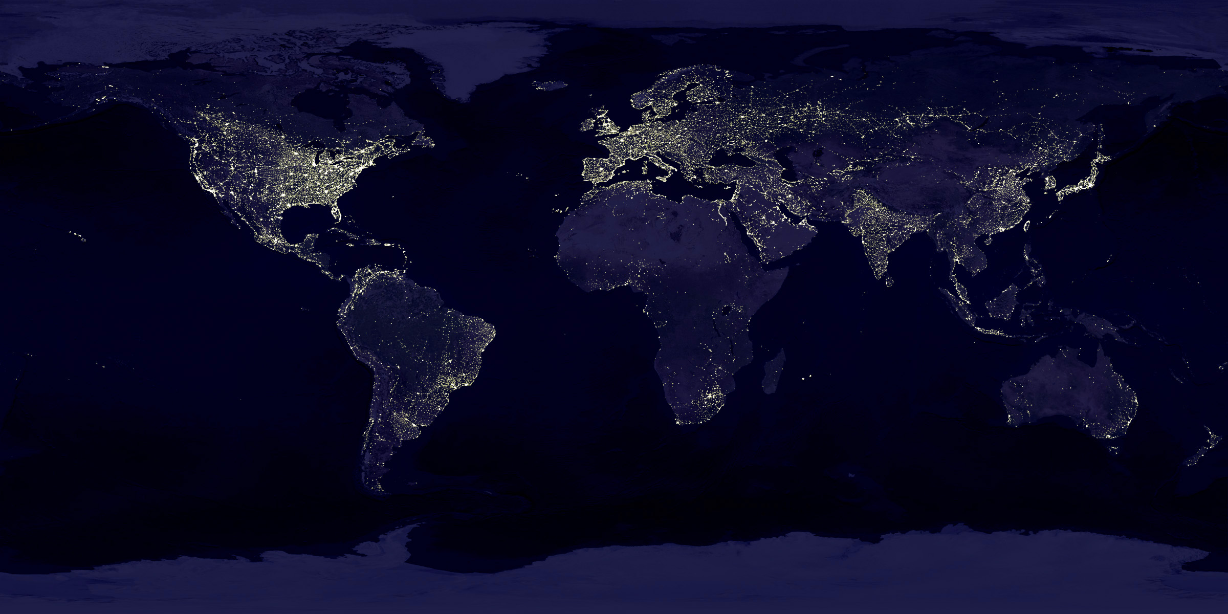
Note the Nile River delta, the Siberian Express railway route, the Australian coastal cities, and Africa, literally "the dark continent".From Princeton's International Networks Archive, the old project of Jonathan Harris.


Follow me on Twitter

Follow the Twitter List
"Cool Infographics People"

Subscribe on your Amazon Kindle


