
Showing posts with label body. Show all posts
Showing posts with label body. Show all posts
Monday, August 11, 2008


Wednesday, July 30, 2008
Bio-Suit EVA Infographic Poster

From the Man Vehicle Lab at MIT, an infographic poster from professor Dava Newman and illustrator Cam Brensinger. The poster shows the technology development in spacesuits and some future design concepts.
Tuesday, July 29, 2008
Radiohead: House of Cards visualization video
Really cool use of visualization tools to create this music video for Radiohead's "House of Cards".
Check out this link to a different version on Google that lets you move the video image around while its playing. and the "making of" video that shows the laser scanners they used.
Radiohead just released a new video for its song "House of Cards" from the album "In Rainbows".
No cameras or lights were used. Instead two technologies were used to capture 3D images: Geometric Informatics and Velodyne LIDAR. Geometric Informatics scanning systems produce structured light to capture 3D images at close proximity, while a Velodyne Lidar system that uses multiple lasers is used to capture large environments such as landscapes. In this video, 64 lasers rotating and shooting in a 360 degree radius 900 times per minute produced all the exterior scenes.
Watch the making-of video to learn about how the video was made and the various technologies that were used to capture and render 3D data
Sunday, March 2, 2008
What if...

Craig Robinson, from flipflopflyin.com, has created a graphic showing many of the different paths/branches his life could have taken. Clicking on each character icon reveals text describing the event or deviation from actual events.
Who hasn't at one time or another wondered how their life could've gone in other directions if different events had occurred or different choices been made? These are the ways my life could've deviated from its actual path (the top row)." Craig dies at the age of 34, killed by an angry swan" I found incredibly funny.
Found on NiXLOG.
Saturday, March 1, 2008
Lance's Last Tour

I found two good newspaper infographics from 2005 covering Lance Armstrong's last Tour de France on newsdesigner.com where you can get larger PDF files that make good posters. Both are two-page graphics (doubletrucks). The first is from The Oregonian (above), and the second is from the St. Pete Times (below).

Found on NiXLOG.
Sunday, January 27, 2008
The Marathon Meal
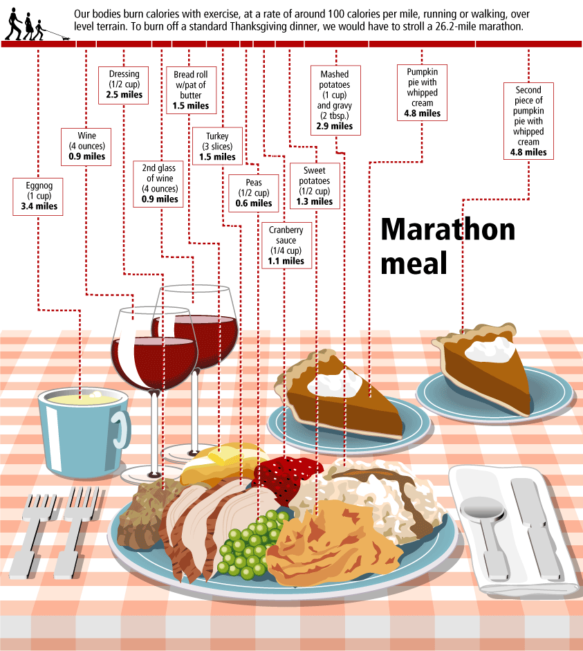
You have to walk 26.2 miles (a complete marathon!) to burn off the calories from a standard Thanksgiving meal, shown here broken down by each dish included. That extra piece of pumpkin pie is worth 5 miles!
This infographic is from Gary Newman Design, who does some fantastic work.
Clarifying Cloning

From The Genetics and Public Policy Center, an infographic demonstrating the difference between research cloning and reproductive cloning.
Tuesday, January 8, 2008
One Year in Iraq

New infographic from nytimes.com depicting the 2,592 deaths in Iraq over the course of the entire year of 2007. The graphic is credited to Alicia Cheng, a graphic designer at mgmt. design in Brooklyn.
The chart below — compiled from data provided by the American and Iraqi governments and news media organizations (the independent Coalition Casualty Count in particular) — gives information on the type and location of each attack responsible for the 2,592 recorded deaths among American and other coalition troops, Iraqi security forces and members of the peshmerga militias controlled by the Kurdish government.I think this is an improvement over the "31 Days in Iraq" graphic because the new graphic identifies every death as a separate figure instead of grouping some together. There are also some differences in data, as the new graph doesn't include the Iraqi civilian deaths. So the "31 Days in Iraq" graphic showed over 1,900 deaths in January 2007, this new graphic only shows 163 deaths in January.
And, sadly, civilian fatalities in Iraq last year were simply too numerous to represent on a single newspaper page.
I'll keep an eye out in early February to see if they publish one for the month of January as they have the last couple of years.
Tuesday, January 1, 2008
Smoking Kills 200,000 Every 6 Months


Skull With Cigarette, 2007 [based on a painting by Van Gogh]
72x98"
Depicts 200,000 packs of cigarettes, equal to the number of Americans who die from cigarette smoking every six months.
I've become a big fan of Chris Jordan's work, especially the Running The Numbers series. I just noticed that he has added to the collection on his website with some new pieces! A friend of mine quit smoking this week, so in her honor I want to share one of the new artwork pieces.
Saturday, November 24, 2007
Visualizing the Aging Process

Created by John D. Furber at Legendary Pharmaceuticals, this is a visual representation of the biology behind aging using a network diagram. A large format image is available for printing here.
From VisualComplexity:
John D. Furber of Legendary Pharmaceuticals has put together a visual model of aging referred to as 'The 2007 Network of Biological Interactions in Human Aging' that shows the interactions between various subcellular, cellular, extracellular matrix and organ system. This is a great representation of aging as it demonstrates no root cause but rather a network of problem areas that are interlinked. The goal of systems biology would be to flush this out in great detail allowing one to zoom in down to the specific genomic and proteomic components of aging. Systems biology would also pursue such a model to have a functional runtime component to it such that variables could be tweaked and changes introduced to predict impact elsewhere in the various biological networks.
Friday, October 19, 2007
The Flu Virus

Flu season is coming soon, so its about time to know your enemy. Graphic of the Flu virus from newscientist.com.
Kinda looks like a big squishy ball doesn't it?
Sunday, October 14, 2007
Nip and Tuck


From Many Eyes, this bubble chart shows the number of plastic surgery procedures per 100 people, by nation. Let's just say, the U.S. is one of the smaller countries measured this way.
Monday, September 24, 2007
31 Days in Iraq
 This map of Iraq from the NYTimes.com visually shows the over 1,900 people killed in Iraq during the month of January 2007.
 "The map, based on data from the American, British and Iraqi governments and from news reports, shows the dates, locations and circumstances of deaths."The number has doubled since they did this for January 2006 which had around 800 deaths. Each figure represents an individual of the American forces, coalition forces, Iraqi forces, police officers or civilian death. The larger figures have numbers showing how many people they represent (which I think diminishes the visual impact). A smaller icon shows the cause of death. All the figures are connected to a location in the country.
I would have added some color coding too, but I'm guessing the NY Times had to keep it in black & white to print it in the newspaper.
Monday, August 27, 2007
The Price of Piercing

The risks associated with body piercing from the Washington Post in November 2006. The information goes as far as male and female genitalia, but they wisely decided not to include those in the image. Why would you pierce those voluntarily?!?
The image shows obvious placement on the body. The number of squares represents the healing time necessary with the dark color representing the minimum time, and the lighter color showing the potential longer time to heal. I would have also showed the price to have each area pierced, but they neglected to include that.
Who would have thought that a pierced nipple could cause a "breast-feeding impairment"? Let's hope the baby doesn't confuse the nipple ring for a teething ring!
Subscribe to:
Posts (Atom)


