Showing posts with label experience. Show all posts

Tuesday, October 27, 2009

Eye Tracking Infographic Plots


Eye tracking is used is a number of different fields of study; consumer interaction design, advertisements, product packaging, website/software usability, store shelf merchandising design and many more.  The results are plotted visually as an infographic, because it instantly makes the data understandable to the researchers.

In the fixation map image above, a participant's focal points on a website are tracked and the points are numbered in sequential order (like connect-the-dots).  The dots are also each sized based on "Gaze Duration", the amount of time the participant spent looking at that particular point.  In the example above, it took the participant 90 fixations to find the information they were looking for...not a good site design.


Of course, you can narrow down the fixation points and only see the first few points that attracted the participant's attention.  Answering the question "What does the user see first?"  In this example, the participant looking at the flight website saw the hotel ad first.


It's not just for websites.  When you use this method for product packaging, you can tell what the consumer sees in the store during the first few seconds, and the popular understanding is that you only have 3 seconds of the consumer's attention in the store.  The use of the infographic fixation map instantly conveys to the packaging designers what the consumer sees, and what parts of the design are ignored.


The fixation maps are converted into heat maps to aggregate many participant results together.  You can see here that participants aren't seeing the "Diesel for Successful Living" message.

Thanks to Colin from IDG Consulting for providing the images!  I have used IDG for consumer research projects in the past, and I highly recommend them.

Monday, October 26, 2009

Procrastination: The Infographic Video


Although I really like this video by Johnny Kelly at Design You Trust (Good-Okay-Brilliant-Great job Johnny!), I not convinced this is infographics.

What do you think?  Is this infographics or illustration?

Found on The MLxperience

Wednesday, October 14, 2009

10/GUI - Re-imagining a Desktop Touch Interface


10/GUI from C. Miller on Vimeo.

A little off-topic, but I love this video idea for a new touch interface to replace the mouse from 10/GUI. Designed by R. Clayton Miller.
This video examines the benefits and limitations inherent in current mouse-based and window-oriented interfaces, the problems facing other potential solutions, and visualizes my proposal for a completely new way of interacting with desktop computers. 
Thanks for the link Tyler!  Found on Ignore The Code.

Thursday, September 3, 2009

reMap: An Amazing Visual Browsing Interface to VisualCompexity.com


Bestario has created reMap, an interactive portal to view all of the infographics posted on VisualComplexity.com, and it's amazing.  They've created semantic connection between the different infographics using tags tat allow for an incredible browsing experience.

An interactive, visual browsing interface to an infographic archive.
reMap displays visualcomplexity.com projects allowing navigation using a semantic approach and depicting relations among them. All images and texts belong to vc portal. Tags are assigned using a semantic engine created by Bestiario.
Thanks Jose!  I love it!

Wednesday, August 12, 2009

Improved Microsoft Windows 7 Upgrade Chart

The chart above is NOT from Microsoft.  Ed Bott, over at ZDNet, was able to quickly redesign the Windows 7 Upgrade Chart from Microsoft in about an hour.  And Ed's a journalist.

The original chart (below) is unnecessarily complicated and hard to comprehend.  I generally don't post about bad infographics, but in this case Ed was able to re-do Microsoft's chart into the improved, simpler version you see above. 

Honestly, the upgrade process is still too complicated and Microsoft should be ashamed of themselves.  This deserves a new Mac vs. PC ad just by itself.

Found on Engadget and All Things D.

Here's the official "horrendous" (I don't get to use that word often) chart from Microsoft.

Monday, April 27, 2009

The AlloSphere: Step inside your visual data!


Awesome sphere that you step into and become completely immersed in visual data!  I can't wait for one of these to be available for the public to experience.  Great TEDTalks video.
JoAnn Kuchera-Morin demos the AlloSphere, a new way to see, hear and interpret scientific data. Dive into the brain, feel electron spin, hear the music of the elements ... and detect previously unseen patterns that could lead to new discoveries.

Tuesday, April 7, 2009

Can design save the newspaper? (Jacek Utko)


Short TED Talk by Jacek Utko that explores how design can not only improve newspapers, but also your product or brand.
Jacek Utko is an extraordinary Polish newspaper designer whose redesigns for papers in Eastern Europe not only win awards, but increase circulation by up to 100%. Can good design save the newspaper? It just might.

Tuesday, March 24, 2009

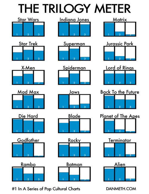
The Trilogy Meter


Dan Meth did a great job creating his own personal Trilogy Meter showing his personal enjoyment of movies released as a trilogy.  This shows that Dan never likes the 3rd movie as much, so he should just stop spending the money.

Although this is based on Dan's personal ratings for each movie, there's no reason why something like this couldn't be done with more official data like critic ratings or box office dollars.

Thanks for the link Jesper and Daniel!

Monday, March 9, 2009

Microsoft's Vision 2019


Apparently by 2019, we will all live in an infographic world, and that's good news for us.  Microsoft had the first public showing of the video at the Wharton Business Technology Conference.  Some found Microsoft's video inspiring, and some were not impressed.

I love some of the ideas shown in the video, but much of it also felt like the magic of Hollywood.  Because this blog is focused on infographics, I understand how much thought and effort from the designer goes into making just one infographic image useful and easy to understand.

Tuesday, January 20, 2009

Dramatic Shift in Marketing Reality


Scholz & Friends: "Dramatic shift in marketing reality from Michael Reissinger on Vimeo.

Great little video from Michael Reissinger on the need for innovation and consumer interactions in today's marketing world.

Found through Twitter: @stonepayton

Friday, December 26, 2008

Anamorphic Parking Garage Signage


These are images from the Eureka Tower in Melbourne, Australia.  Emery Studio (look at the "Placemaking" link) had the opportunity to use both the horizontal and vertical surfaces to design some anamorphic signage in the parking deck.  When viewed from the correct direction as you're driving, the words appear legible and lead you in the correct direction.  Viewed from another angle, the words appear as abstract lines and colors.


Thanks Ethyl for sending the link on Twitter!  Images are from the Kosmograd blog.

Thursday, November 13, 2008

Seasonal Visual Timelines


Roberto Rovira, and assistant professor of landscape architecture at the Florida International University's, School of Architecture, was kind enough to allow me to share some of his work with the readers of Cool Infographics.
 
Working as a consultant, these seasonal timelines were developed to show the activities and the plants used in a proposal for a project he led called "Envisioning Hudson Square" on the Hudson River near Manhattan, NY.
 
The first one shows the time of year that different activities would be active in this green area during the year like bicycling, bird watching and ice skating.  It also shows the different wildlife that would be present during the year like blue heron, striped bass and snowy egrets. Using the visual timeline you can see how the different activities overlap and that there would always be some type of activity during the year.
 
The second timeline from the same project show the proposed plant and trees to be used in the project, and with the use of the visual timeline shows their color and appearance throughout the year.
 
Graphics by Roberto Rovira, RLA, with assistance from landscape designer Kelly Woodward. Roberto is Assistant Professor in Landscape Architecture at Florida International University (www.fiu.edu/~soa) and Senior Landscape Architect consultant for ArquitectonicaGEO (www.arquitectonicageo.com), a Miami-based landscape and planning firm. He led GEO's design team and developed the concepts for 'Hudson Square Prints Green!', a proposal for a 30-block New York City district on Manhattan's West Side, adjacent to the Hudson River.

Monday, August 4, 2008

The Art of Visual Thinking


Last week, Guy Kawasaki posted a good interview with Dan Roam on his blog.

Do you recognize this picture? It's how Southwest Airlines was pitched.
To provide more insight into the process of visual thinking, I tapped Dan Roam. He is the author of The Back of the Napkin: Solving Problems and Selling Ideas with Pictures . In this interview he explains why and how to use visual thinking in your business. Click here to read it. To learn even more about visual thinking, be sure to read his book.

Wednesday, July 23, 2008

Map of Online Communities


Greetings from the Blogipeligo!


A fun infographic from xkcd.com that uses a map image to communicate the relative sizes of the different types of online communities.  I was impressed that I at least recognized most of them, and actually participate in some of them.

Monday, July 21, 2008

When are you at risk online?


From the Mozilla website, and obviously a part of their sales pitch.  I picked up that the calendar arrangement of the squares is in fact correct for 2006.  Its getting the small things right that help make good infographics.

An independent study shows that, in 2006, IE users were vulnerable to online threats 78% of the time. Firefox users? Only 2%.


“At risk” defined as publicly available exploits with no patch. Source: “Internet Explorer users Unsafe for 284 Days in 2006” Brian Krebs, Washington Post, 1/4/2007

Wednesday, June 25, 2008

The Summer of Pool Shows


Another page of quirky charts from Andrew Kuo that I came across from October 2007. These try to represent information about the 2007 summer's series of concerts at Brooklyn's McCarren pool.

Found on CoolHunting.com

Tuesday, June 24, 2008

Pessimist's Guide to Summer Festivals

A full page of different chart styles by Andrew Kuo on nytimes.com. A number of Andrew's quirky charts have been showing up in the NY Times lately.
When he was 15, in 1992, the artist Andrew Kuo tagged along with his older brother to the second year of Lollapalooza in Stanhope, N.J. It was Mr. Kuo’s first summer festival, and he was so excited that he bought the albums by most of the bands on the bill beforehand. Then, halfway through the show, after sets from Pearl Jam (his favorite) and the Jesus and Mary Chain, “I didn’t want to be there anymore,” he said. “I felt like I was being held captive.” Thus began his lifelong ambivalence toward outdoor festivals. “When you finally get to the picnic, there’s ants everywhere,” Mr. Kuo said. Here’s a pessimist’s guide to the summer festival season, which kicks into high gear with the Bonnaroo Music and Arts Festival on Thursday in Manchester, Tenn. Mr. Kuo will be home napping.
Thanks Sandhya!

Saturday, June 21, 2008

Fly Through Airport Security


"How to...Fly Through Airport Security" illustration by Jason Lee from Wired Magazine, March 2008 (16.03).
You might as well check your dignity curbside. Soon you'll be shoeless and flustered, spilling comics across the floor as you dig your MacBook from the depths of your duffel. But take a deep breath, frequent fliers: It is possible to pass security with your ego intact. Here's how.

Wednesday, June 18, 2008

Car HUD from the future


From the January 2008 (16.01)Wired Magazine; Artifacts from the Future, by Chris Baker. This future automobile HUD has some really cool features like a DUI driver identified ahead, in-car video chat, live GPS map with directions and a coupon for the Starbucks at the next exit. He's doing 90MPH, eating an energy bar and he's in the slow lane! For California, there definitely aren't enough cars on the road!

Looks a lot like a bunch of widgets on the desktop of your PC. It definitely seems too cluttered, but I think it was necessary to fit it on a narrow magazine page. I love that it seems to use a multiple-blink interface. Check out the calendar appointment in the top left: "...blink 3 times to reschedule."

If only this future were closer. I'm a real fan of car HUD interfaces. It's one of those promised technologies that still haven't become reality.

Friday, June 6, 2008

The Flickr User Model


Designed by Soldier Ant (his real name is Bryce Glass), the Flickr User Model attempts to map out the Flickr user experience. This is version 0.1, and I think he's working on version 0.3 now. Also linked on visualcomplexity.com
On his post on October 24, 2005, Bryce explains: "I've been doing some concept diagramming for work lately, and I've found myself enjoying it immensely. (...) However, since it's for work I can't share much of it. I did post some sanitized versions, with all the object-names obsfucated, but that just didn't seem wholly satisfying. So over the weekend I invested some time in a diagram that I can share with the internets: a simple Flickr user model (regrettably incomplete -- but I realized that if I tried to include the whole Flickr-verse that this diagram would go beyond labor of love and straight into excercise in folly)".
Thanks Rex for sending in the link!