Showing posts with label oil. Show all posts

Tuesday, September 15, 2009

Is the U.S. Too Dependent on Foreign Oil? (infographic)


The U.S. imports 60% of its oil requirements, and this infographic map shows the top 10 countries that are sending us their oil.  I think it will actually be quite surprising to most Americans how little is imported from the Middle East.
As much as 66 percent of all US crude oil is imported from other countries, and the amount of oil imported from OPEC nations is roughly equal to the amount of oil produced domestically. Petroleum, natural gas and coal are the primary sources of energy consumed in the United States because they are the most energy rich resources available. So far, renewables have only been capable of providing a small portion of total energy consumption, and their contribution to energy consumption has remained limited over the last two decades. However, with increasing government and private focus on green energy sources, renewables are likely to go from strength to strength in the near future.
Here's the original article by Callum James from ngoilgas.com.

Monday, February 9, 2009

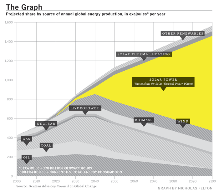
"The Graph" - The Future of Solar Power


Known as "The Graph" in scientific circles, this chart projects the future of solar power.  It was highlighted in a Fast Company article in December 2008.
The Graph was created by a scientific organization that counsels the German government, but it has since become a prized piece of propaganda, embedded in glossy brochures and PowerPoint presentations by solar companies from California to gray-skied Saxony. At the left-hand, present-tense end of the scale, solar power is a microscopic pencil line of gold against the thick, dark bands of oil and natural gas and coal, an accurate representation of the 0.04% of the world's electricity produced by solar power as of 2006. The band grows slowly thicker for 20 years or so, and then around 2040 a dramatic inversion occurs. The mountain-peak lines indicating the various fossil fuels all fall steeply away, leaving a widening maw of golden light as solar power expands to fill the space. By 2060, solar power is the largest single band, and by 2100 it is by far the majority share.

Friday, September 26, 2008

The Rush to Wind Farms!


The rush to wind farming is an interesting article in The Atlantic.  With Federal subsidies, its almost like a land rush.  The planned expansion of wind farm sites is impressive.

Thanks for sending in the link Garrett (also posted on Capturing Ephemera)!

Sunday, April 27, 2008

Who Owns the Car Companies? (UPDATE)


TooManyCars.com has updated their family tree style poster of how all of the car companies are related. The latest updates were as of 4/1/08. They have also changed to better software used to zoom into the poster. Each of rectangles you see on the images will zoom in close so you can read the details about the connections.

They've really done a good job tracking down the specific types of relationships and the ownership portions between the companies. High-res PNG or PDF files are also available.

Monday, January 21, 2008

Harnessing the Wind


From the Telegraph in the UK, the idea is to use a kite to help pull a ship across the ocean. by using the wind power at high altitudes the ship would save on energy consumption.
Its inventor, Stephan Wrage, a 34-year-old German engineer, claims the kite will significantly reduce carbon emissions, cutting diesel consumption by up to 20 per cent and saving £800 a day in fuel costs.
Found on digg.com

Wednesday, January 16, 2008

The Price of Gasoline

This image was real popular on Digg.com this week. It's hosted on tinypic.com, but there's no author listed.

I love simple infographics like this that use a visual metaphor to instantly get the point across. You can tell someone that the price of gas is comparable with Coke, but putting gas in the Coke signature bottle will get more people to understand the message.

My own reaction was probably the opposite of what the author intended. My first thought is "Coke costs how much?!?" I know there is a lot more expense in producing gasoline than there is in producing Coke. They must really be marking the price up a lot for brown sugar-water.

There is a similar analogy in the U.S. regarding bottled water. Some bottled water brands are now more expensive than gasoline! How is that possible?!?

Saturday, November 17, 2007

Who has the Oil?


I caught this on Digg, it's a map from civicactions.com. There's some good debate in the comments on Digg about the accuracy of the map.

The size of the country represents the relative amount of oil reserves in each country, and teh color of the country represents how much oil is consumed by that country.